Minds On
Let’s get started!
Notice and wonder
Explore the following artwork by artist Michaela Goade. The illustrations are for different stories.
- What kind of message is the artist trying to convey?
- What might the stories be about?
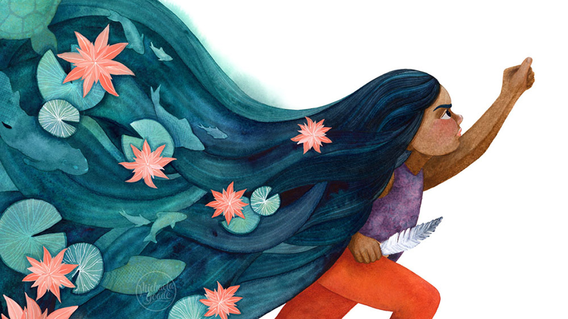
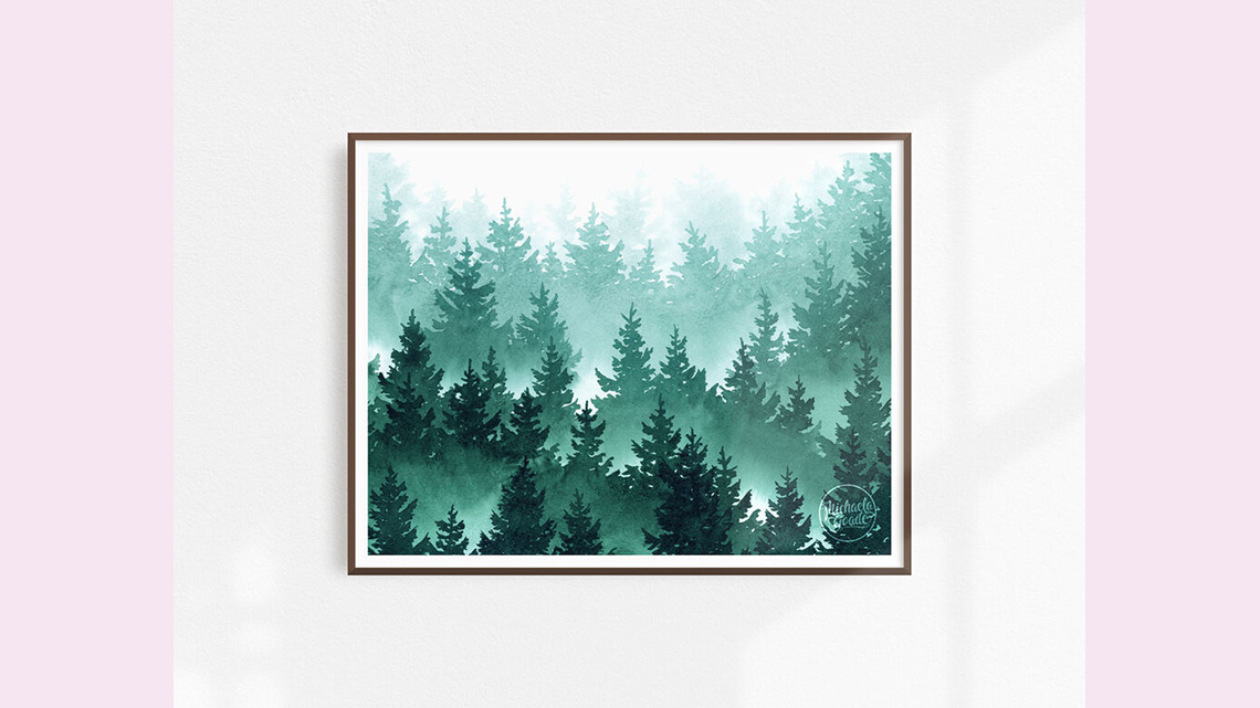
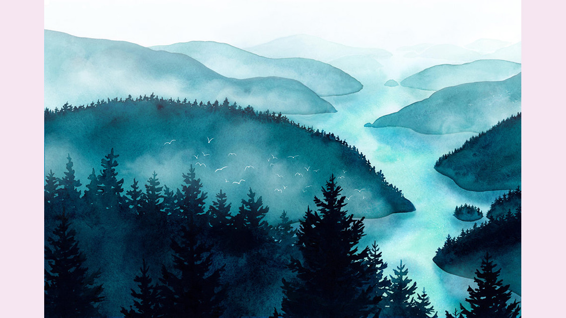
A carousel of three images. Image 1: Fog Forest, Michaela Goade. A watercolour painting of a forest created using a monochromatic colour scheme. The colours of the trees are darker in the foreground, begin to lighten in the middle ground, and become lightest in the background. The forest appears to be covered in fog. Image 2: Inside Passage, Michaela Goade. A watercolour landscape painting created using a monochromatic colour scheme. The trees in the foreground are darkest, while the river and hills in the middle ground and background become lighter. There is an outline of birds flying above the trees. The whole landscape appears to be covered in mist. Image 3: We are Water Protectors, Michaela Goade. A watercolour illustration of a person. They are holding up a fist and reaching forward. They clutch a bird feather in their other hand. Their hair flows out behind them and resembles the rippling water of a river. Fish and turtles swim just below the surface. Water lilies grow on the surface of their hair. The person’s hair is created using a monochromatic cool colour scheme. However, the artist has also used contrasting warm colours to create the person’s orange pants and the orange-pink lilies in the person’s hair.
Action
Get ready, get set…
Michaela Goade
In the Minds On section, we explored the work of children’s book illustrator Michaela Goade. Goade was raised in the rainforest and on the beaches of Southeast Alaska, traditional Lingít Aaní (Tlingit land). She currently lives in Sheet’ká (Sitka), Alaska. She is an enrolled member of the Tlingit and Haida Indian Tribes of Alaska. Her Tlingit name is Sheit.een and she is of the Kiks.ádi Clan (Raven/Frog) from Sheet’ká.
Children’s book illustrator
A story book illustrator creates pictures (i.e., paintings, drawings etc.) for children’s books. An illustrator works with the author to create images that are appropriate for the audience and help share the author’s perspective of the story.
Goade’s work is inspired by the world around her that includes the plants, animals, waters, and lands in her community. She also likes to create her work to show her appreciation and gratitude for the land and waters and to motivate others to protect the earth as well.
“I work to capture the feel of this environment, whether it’s through the seemingly endless shades of blues, greens, and grays, the way mist and light interact with the trees and waves, or the beautiful animals and plant life that call this region home.” – Michaela Goade
Goade has been working with Indigenous authors to create illustrations for books like We are Water Protectors by Carole Lindstrom. We Are Water Protectors is a beautiful book about protecting the water in our world. Water is very important for every living thing on this earth.
Let’s explore the illustration from We are Water Protectors once again and think about the following questions. Record your ideas using a method of your choice.
- How does the illustration make you feel?
- Why is it important to protect and respect the waters?

We are Water Protectors by Michaela Goade
A watercolour illustration of a person. They are holding up a fist and reaching forward. They clutch a bird feather in their other hand. Their hair flows out behind them and resembles the rippling water of a river. Fish and turtles swim just below the surface. Water lilies grow on the surface of their hair. The person’s hair is created using a monochromatic cool colour scheme. However, the artist has also used contrasting warm colours to create the person’s orange pants and the orange-pink lilies in the person’s hair.
Youth advocating for the waters
Autumn Peltier is an Anishinaabe youth from Wiikwemkoong Unceded Territory, a First Nation community on Manitoulin Island. She advocates for the protection of the waters.
Explore the following video entitled “AUTUMN Water Advocate” to learn more about her advocacy to protect the waters.
Pause and Reflect
Time to reflect
Let’s take a moment and reflect on the following questions.
- Why is water important to Peltier? What is the role of water in her life?
- How does Goade’s illustration connect to the action and advocacy of Peltier?
- What is the role of water in your own life?
Record your ideas using a method of your choice.
What are tints?
Goade creates tints in her artwork to create a monochromatic colour scheme. This creates a calming effect and helps the audience connect with the artwork.

Tints are colours mixed with white. These colours tend to produce lighter, softer hues, such as baby blue or peach. When you’re using watercolour on white paper, you add more water to the paint, and it appears lighter. This is because the paint is becoming more transparent when you add water. The white paper shows through the colour.
What different categories of colours exist? What happens when colours are mixed?
There are warm colours and cool colours. When warm colours and cool colours are put next to each other, it creates contrast.
Press ‘Hint’ to learn more about warm and cool colours.
Warm colours are red, orange, and yellow.
Cool colours are purple, blue, and green.
Have you ever mixed colours to get other colours?
Red, blue, and yellow are called primary colours because we cannot make them from other colours. Orange, green, and purple are called secondary colours because we need two colours to create them.
Press ‘Hint’ to learn more about mixing colours.
- yellow + red = orange
- red + blue = purple
- blue + yellow = green
Explore the following image that shows how primary and secondary colours are organized on the colour wheel.

A colour wheel with primary colours (red, blue, and yellow) and secondary colours (purple, green, and orange). Warm colours, such as red, orange, and yellow are grouped on one side of the colour wheel. Cool colours, such as purple, blue, and green are grouped on the other side of the colour wheel.
Go!
Your turn
Explore the following video entitled “Painting – Waves” to learn about using watercolours to recreate your favourite beach waves!
Pause and Reflect
Time to reflect
Let’s take a moment and reflect on the following questions.
- What did you notice in the video you just explored?
- Did you notice the artist leave a gap between the waves to show the wavy white line?
- Did you notice how they changed colours by blending and adding more water to make it lighter?
Record your ideas using a method of your choice.
We are Water Protectors
Let’s return to the illustration from We are Water Protectors we examined in the learning activity earlier.

We are Water Protectors by Michaela Goade
A watercolour illustration of a person. They are holding up a fist and reaching forward. They clutch a bird feather in their other hand. Their hair flows out behind them and resembles the rippling water of a river. Fish and turtles swim just below the surface. Water lilies grow on the surface of their hair. The person’s hair is created using a monochromatic cool colour scheme. However, the artist has also used contrasting warm colours to create the person’s orange pants and the orange-pink lilies in the person’s hair.
Pause Reflect
Time to reflect
Let’s take a moment and reflect on the following questions.
- How does Goade create contrast in the illustration?
Press ‘Answer’ to learn about how Goade creates contrast in the illustration.
Goade uses complementary colours to contrast the cool colours used for the character’s hair with the warm colours of the water lilies and the character’s clothing. This creates variation and energy in the illustration.
- What kind of message is Goade communicating through her illustration?
Press ‘Answer’ to learn about the message Goade is communicating through her illustration.
The character’s hair might symbolize water and their connection to it, and the lilies growing out of it represent life.
Consolidation
Putting it all together
Creating your artwork
Materials Needed
Materials you might need
Possible materials you might need for this learning activity:
- pencil
- watercolour paint or water-based markers (if using markers, just draw around the design with the marker colour you like. Then dip into water and pull the colour out of the marker line into the spaces you want that colour in)
- paint brush
- watercolour paper or thick paper (not construction paper)
- masking tape or crayon is helpful to block areas, but is not required. If you tape your paper down to the table until your art is dry, your paper won’t curl
- water
- a paper towel or tissue is useful if you want to remove paint, or if it spills a little
Student Success
Exploring digital creation options
When you are considering digital creation options, explore the variety of digital applications available!
Note to teachers: See your teacher guide for collaboration tools, ideas and suggestions.
Safety
Always be sure to do your safety checks before you do an activity.
Before you begin, check:
Consider your own relationship with nature, the land, and the waters. You might want to think of your connections to specific lands, waters, animals, and plants in your own community, like Goade does, for inspiration. How might you create your own artwork that conveys this relationship?
Option 1: Description
Create a description of what you would like to include in your artwork to communicate your relationship to the land and waters.
Option 2: Materials
You are going to create your own painting to explore tints, tones, and shades of colours. You may also choose to create a line drawing, varying the type (e.g., wave, straight, curved, jagged) and the thickness of the line to create a particular mood in your work.
Explore the following images to learn about all kinds of lines.
Possible materials you might need for this learning activity:
- pencil
- watercolour paint or water-based markers (if using markers, just draw around the design with the marker colour you like. Then dip into water and pull the colour out of the marker line into the spaces you want that colour in)
- paint brush
- watercolour paper or thick paper (not construction paper)
- masking tape or crayon is helpful to block areas, but is not required. If you tape your paper down to the table until your art is dry, your paper won’t curl
- water
- a paper towel or tissue is useful if you want to remove paint, or if it spills a little
Check out the following video entitled “People of Ontario: Doris Kramer – Artist” to learn a little more about watercolour painting from Kramer! She is a watercolour artist and teacher from Thunder Bay, Ontario.
Now it’s your turn! Explore your own space. Think about your connections in nature. For example, specific plants, flowers, water, and trees that are meaningful or important to you. Pick something in nature or from a photo you took or found online that you would like to paint. It doesn’t have to be complex to be beautiful!
Press the following tabs to check out the steps to create your artwork.
Option 3: Digital artwork

Using a digital application, create your own artwork that reflects your relationship to the land and waters. You may use what you have learned about tints and monochromatic colours schemes to create your work.
Mini task: Creating a monochromatic scale
Monochromatic colours work together to produce a soothing, calm effect, especially blues and greens. These tints, shades, and tones combine to create a mood.
It’s your turn to create your own monochromatic scale. Once you have completed your scale, you may choose to use it as a reference for your painting.
Press the following tabs to check out the steps to create your monochromatic scale.
Create a long rectangle with your ruler or by folding your paper edge or using a digital application. Divide the rectangle into five to seven sections that are of equal size.
Each section should be about 2-3 centimetres wide.
Using one colour pencil crayon or your pencil, colour in one end as dark as you can make it.
In the next section, press a little lighter to get a lighter tone of that colour.
Continue until you have filled in each section except the last, which stays white, pressing a little less in each section.
The idea is it is the same tone in each section like in the following example.

Time to start painting! You might blend the colours on the painting, or you can blend them off the painting, then apply to the paper.
Leave space between the colours if you don’t want them to mix. You could also create a block using white crayon if you want to. If you want the colours to blend together, then they can touch.
Something to think about is that watercolour paints will work the next day. If you let it dry, you can come back to it anytime and add water or other colours. Many watercolour artists let the first layer dry, then add layers to get depth or more colours or shadows in different areas.
Once you’re done painting, remove the tape carefully and let the painting dry completely before lifting it up. If you lift it too soon, the paint will drip down the page.
Portfolio
Track your progress
Consider adding the answers to the following reflection questions to your art portfolio.
- Reflect on your learning in this learning activity. What do you think about your final product?
- How did you use line or colour to create your work?
- How did you explore your relationship and connection with nature, the land, and/or the waters in your piece?
Consider adding your beautiful art to your art portfolio. If possible, share your beautiful art and/or description with a partner!
Reflection
As you read through these descriptions, which sentence best describes how you are feeling about your understanding of this learning activity? Press the button that is beside this sentence.
I feel…
Now, record your ideas using a voice recorder, speech-to-text, or writing tool.


