Minds On
Let's get started!
Notice and wonder
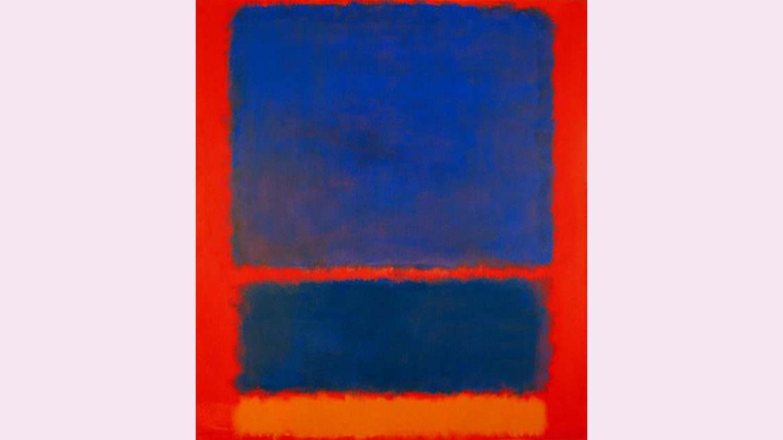
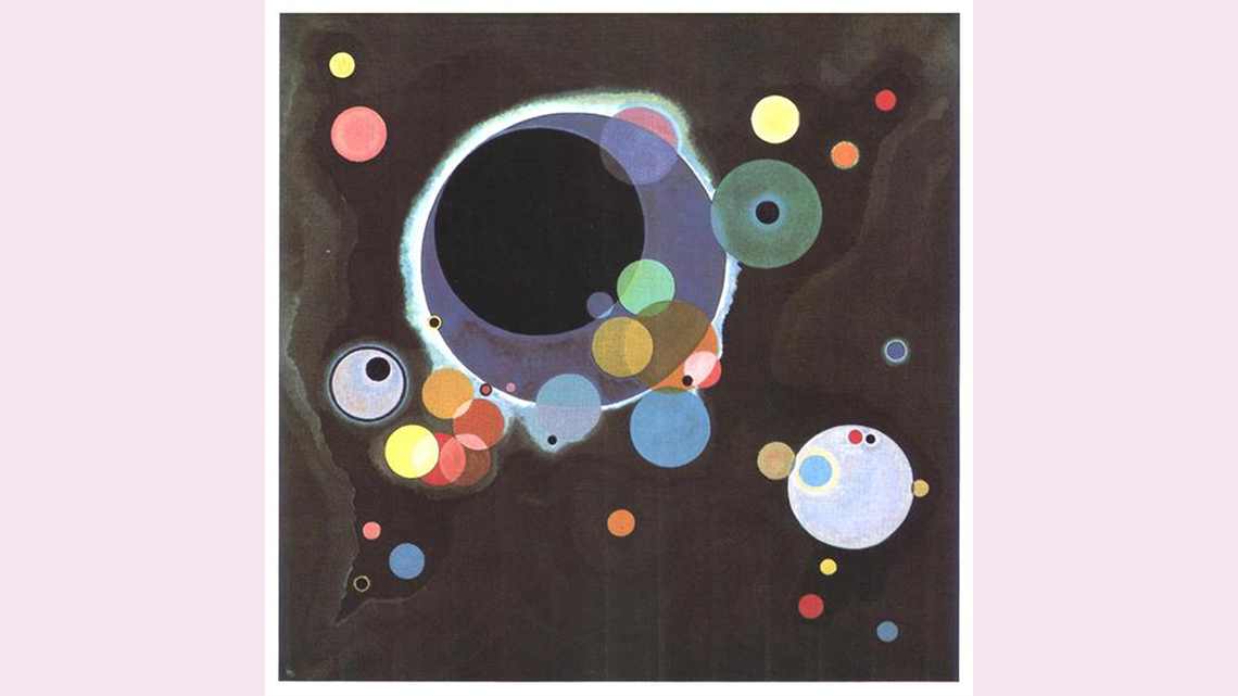
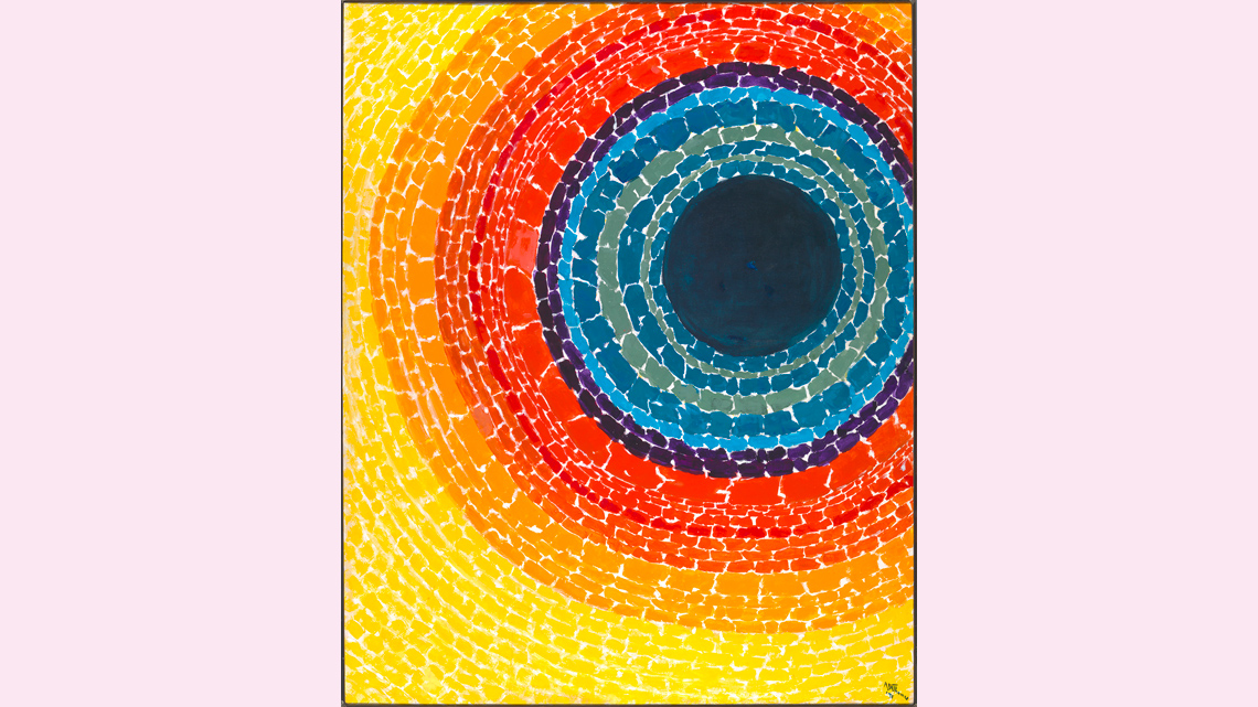
Examine the following art pieces. What do you notice about how each artist used form: their choice of shape, line, and colours? Do you notice any similarities? Do you notice any differences? Record your ideas using a method of your choice. If possible, share your ideas with a partner.
A carousel of three images. Image 1: Blue, Orange, Red by Mark Rothko, 1961. Image One: Blue, Orange, Red by Mark Rothko. Three rectangles of varying sizes arranged vertically. The two larger, upper rectangles are a cool hue that contrast a warm hued background. The smaller, lower rectangle is a warm hue that is similar to, but distinct from, the background. Image 2: Several Circles by Wassily Kandinsky, 1926. Image Two: Several Circles by Wassily Kandinsky. Circles of varying sizes and colours contrast a dark background. Many circles are bunched around a large, central circle. Other circles are spaced apart. Image 3: The Eclipse by Alma Thomas, 1970. Image Three: The Eclipse by Alma Thomas. A radial pattern of outlined circles surrounds a dark, enclosed circle. The outlined circles closest to the enclosed circle are cool hues. The outlined circles farther from the enclosed circle are warm hues.
Action
Get ready, get set…
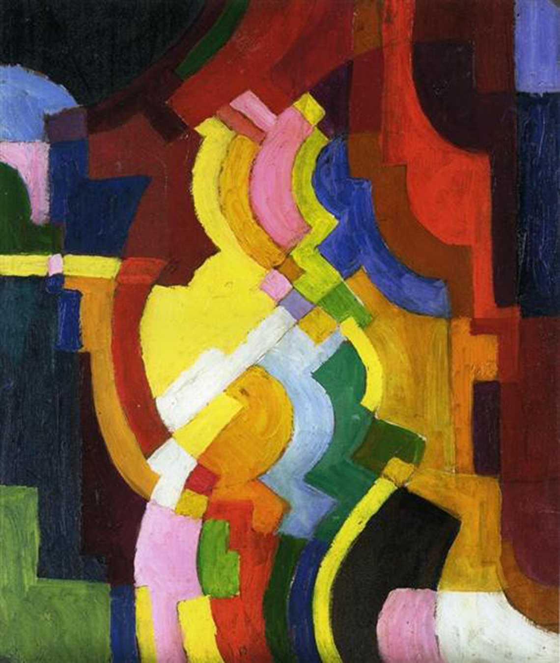
Farbige Formen III by August Macke, 1913
Abstract painting of skinny, curving shapes with some straight edges. The shapes are diverse colours, with vibrant hues in the centre and darker shades around the centre.
What is abstract art?
Abstract art is a type of art with no recognizable object. Abstract art uses shape, line, and colours but does not represent actual objects or living things. When using colour, artists may choose to use complementary colours in their art to convey ideas or feelings. When using line, it is to bring perspective and dimension to the art. When shape is used, it can contribute to a balance in the composition to make it more appealing.
The purpose of abstract art is to encourage imagination as well as involvement from the viewer. It’s not aiming to tell a story but instead allow the audience to experience the art piece the way they want to. By allowing the audience to determine their own meaning of an art piece, they become more involved in the experience.
Abstract art may seem like it’s not purposeful, but it very much is. Artists use form, colour, line, shape, and texture in a very deliberate way.
Colour
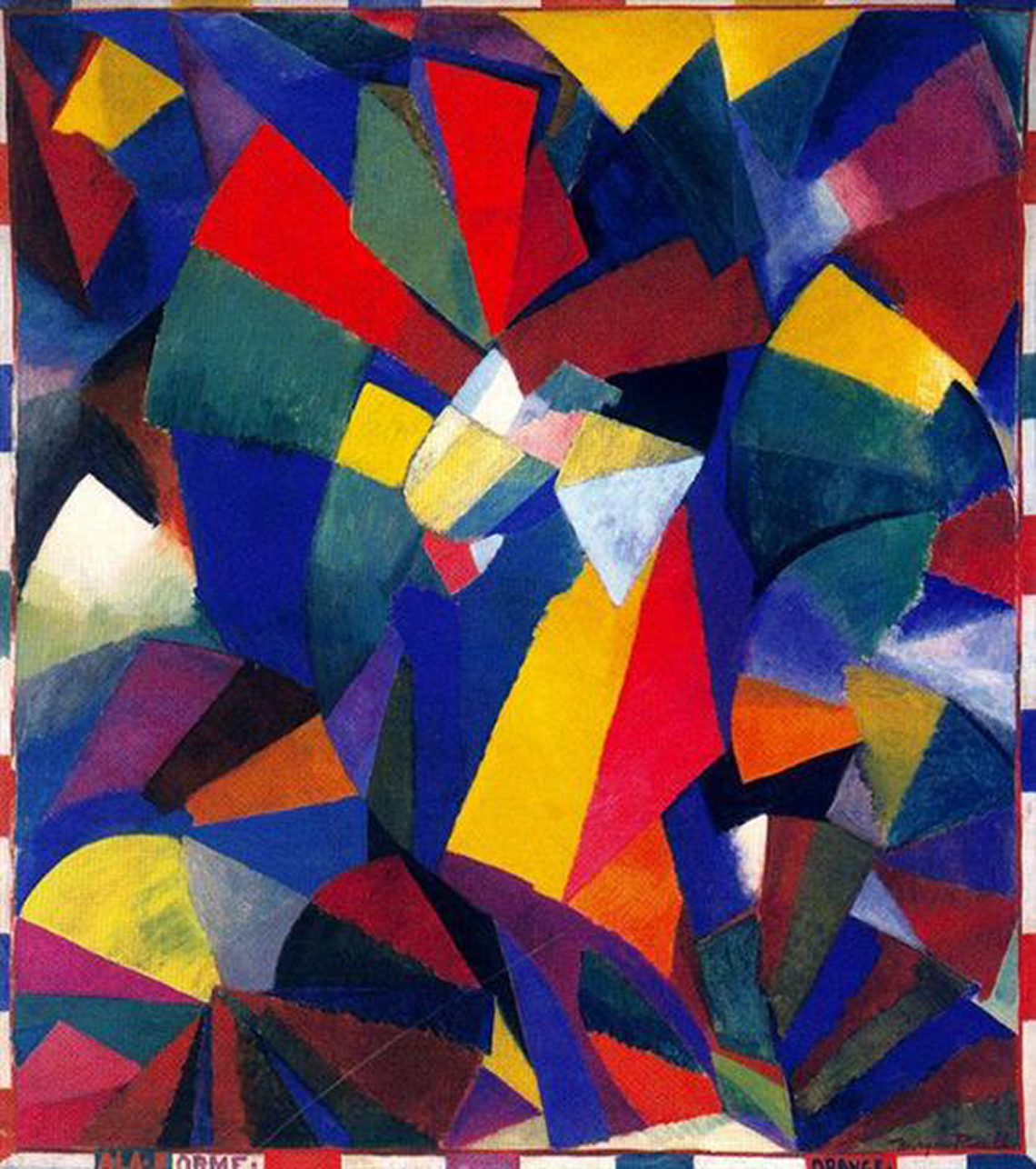
Synchromy in Orange: To Form by Morgan Russell, 1914
Abstract painting of various polygons in diverse colours. Most of the shapes are triangles and most of the colours are primary. There is a skinny border with alternating white and colour stripes.
When artists choose colours for their artwork, they use the colour wheel. They may use a variety of colours to help the audience understand what they are feeling when they created their art. Sometimes they may choose complementary colours.
Press ‘Definition’ to access the definition of complementary colours.
Complementary colours are colours that are directly opposite each other on the colour wheel (e.g red and green, blue and orange, yellow and violet).
Colour is used to express emotions and ideas. When artists discuss colours they use words like warm and cool colours.
Press ‘Definition’ to access the definitions for warm and cool colours.
Warm colours include red, orange and yellow. These colours might remind people of sunshine, fires, and heat.
Warm colours might also be used by some artists when they feel happy, angry, or excited.
Cool colours include blue, green, and purple. These colours might remind us of cool, cold places like the winter or cold water.
Cool colours might also be used by artists to when they feel peaceful, calm, or sad.
Explore the following complementary colour wheel to review what colour theory you may already know.

A colour wheel that shows that red is a primary colour, red purple is a tertiary colour, purple is a secondary colour, blue purple is a tertiary colour, blue is a primary colour, blue green is a tertiary colour, green is a secondary colour, yellow green is a tertiary colour, yellow is a primary colour, orange yellow is a tertiary colour, orange is a secondary colour, and orange red is a tertiary colour.
Examine the following abstract painting from Georgia O’Keeffe. What do you notice about how O’Keeffe used complementary colours? Record your ideas using a method of your choice. If possible, share your thoughts with a partner.
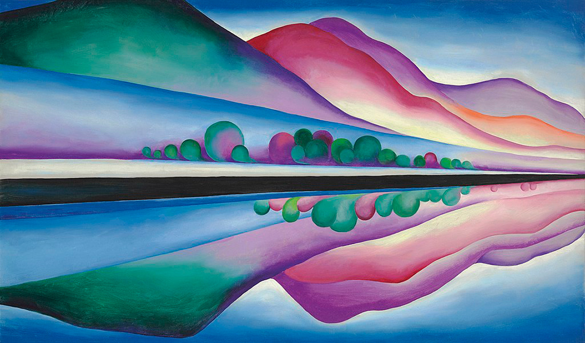
Lake George Reflection by Georgia O’Keeffe, 1922
In this landscape painting, O’Keeffe uses cool colours of green, blue and purple for the hills in the front of the scene, close to the water. There are small trees also in these colours, close to the water. Directly behind the green hill, there is a pink, then a light purple hill with an orange hill in front of the purple hill. These hills appear to be in the sunshine. They are further away from the water. The sky is white until the very top of the painting where a darker blue is included. The bottom half of the painting is the reflection of the hills in the lake and creates a symmetry in the landscape.
Did You Know?
Horizontal or vertical?
Did you know that Georgia O’Keeffe’s painting, Lake George Reflection, can be viewed either horizontally or vertically? When it first was shown at a gallery in New York in 1923, O’Keeffe herself hung it vertically. When viewed horizontally, you can see the hills reflected in a body of water. When it’s hung vertically, it becomes more abstract.
Lines
When artists use shape in their artwork, shape builds on line and colour. Shape is either defined by a line around it or a change in colour. There are two main types of shape: geometric and organic.
Press the following tabs to access definitions of geometric and organic.
Geometric shapes are shapes that are based on geometric figures. Squares, circles, and triangles are all geometric shapes.
Organic shapes or forms are free-flowing shapes. They are irregular shapes. They can be found in nature. They are the opposite of geometric shapes or forms.
Examine the following image featuring the work of Piet Mondrian. What do you notice about Mondrian’s use of line, shape, and colour?
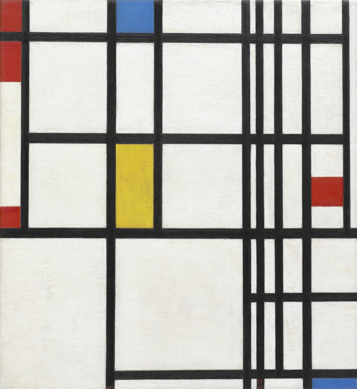
Composition in Red, Blue, and Yellow by Piet Mondrian, 1937-42
This piece of artwork is created using parallel and perpendicular lines that have created geometric squares and rectangles. The lines are thick and dark on a white background. Throughout the artwork, some of the squares and rectangles are coloured in using bold primary colours.
Press ‘Answer’ to learn how Mondrian uses line, shape, and colour.
Mondrian uses straight, vertical, and horizontal lines. These lines are divided in rectangles and squares. The primary colours red, blue, and yellow are used.
Lines
Line is used in abstract art to bring perspective and dimension into the art. There are different types of lines that can be used, including: curved, horizontal, vertical, jagged, thick, thin, and broken.
What are lines?
A line is an element of design. A line is the path left by a moving point, such as a pencil or a digital drawing tool. A line is a mark that leads the audience’s attention in an artwork. There are five kinds of lines: vertical, horizontal, diagonal, zigzag and curved. Explore the following carousel to learn about all kinds of lines!
Go!
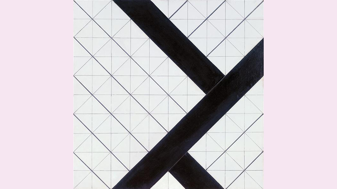
Explore the following carousel of images. While exploring, think about what makes these art pieces abstract. How did the artist incorporate different forms (line, shape, and/or colour)?
Record your ideas using a method of your choice. If possible, share your thoughts with a partner.
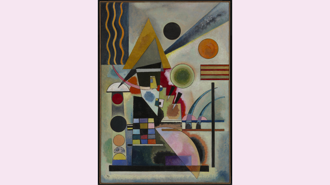
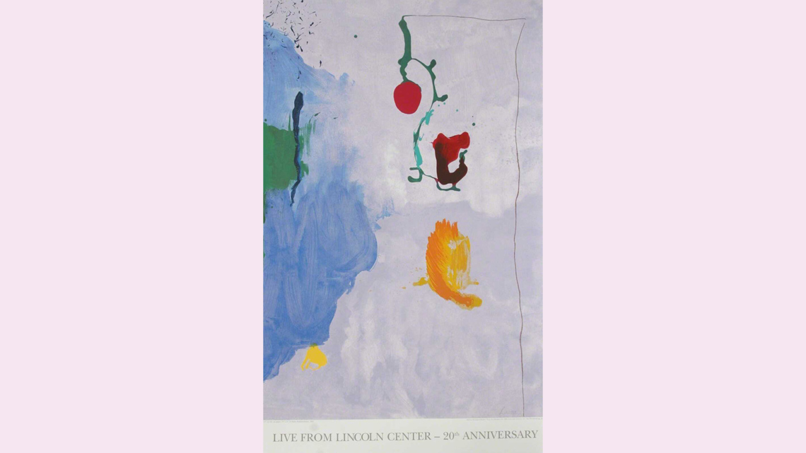
A carousel of three images. Image 1: Counter-Composition VI by Theo van Doesburge, 1925. This painting is a square that has a light background and lines of different thickness. There are three thick black bars in the painting that travel diagonally across the piece. There are lighter lines that create geometric squares and then even lighter lines that divide those squares into triangles. Image 2: Swinging by Wassily Kandinksy, 1925. This painting uses colour, shape, and lines to create meaning. There are both warm and cool colour palettes used within geometric shapes such as circles, rectangles, squares, triangles, and semi-circles. Kandinsky uses many different types of lines as well. There are straight lines, curvy lines, and even some jagged lines in this piece. Image 3: Live from Lincoln Center 20th Year (Eve) by Helen Frankenthaler, 1995. This painting uses colour and shape to create meaning. The background is a wash of light grey and white tones. On the left of the painting a watered-down blue semi-circle with rough edges that takes up much of that side. At the centre top is a medium thick grey-green stroke of paint with a bright red berry-shaped object attached to the bottom of it. There are what appears to be two other objects painted beside the blue semi-circle. One is red and black and the other is yellow. The use of primary colours combined with greens make the objects stand out.
Consolidation
Putting it all together
Time to review your learning! For each of the following statements, select whether they are true or false.
Create your own abstract art
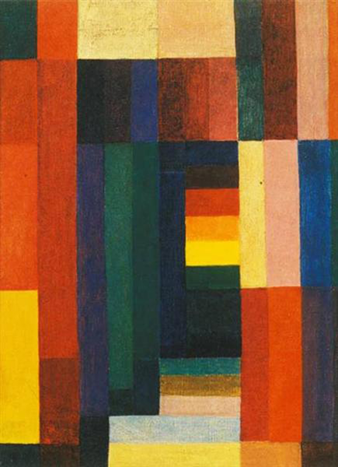
An abstract painting with rectangles of various sizes and diverse colours. Most rectangles are arranged vertically, while the rest are arranged horizontally.
Using the elements of art we explored, you will create a piece of abstract art. It can include line, shape, and/or colour.
Safety
Before you begin, consider these safety precautions:

Decide which element you want to include and create your abstract art piece based on your understanding. Use any material of your choice. You can use found objects, paint, markers, etc.
If you wish, you may record a description using any method of your choice. Include in your description what kind of materials you would use. How would you express different feelings? Would you have a theme? Which elements of art would you include? Why?
Portfolio
Track your progress
Think about the process you have gone through to create your abstract artwork. What do you think about your final product? What do you think is the best part of your art? Is there a part you would do differently if you try it again?
If possible, share your beautiful art with a peer. If you have a portfolio, you can put your art there to track your progress over time.
Reflection
As you read through these descriptions, which sentence best describes how you are feeling about your understanding of this learning activity? Press the button that is beside this sentence.
I feel…
Now, record your ideas using a voice recorder, speech-to-text, or writing tool.
