Minds On
Let’s get started!
Explore the following artwork by abstract artist Wassily Kandinsky.
Abstract art
A modern kind of art that does not try to represent images of the real world. Abstract art is often inspired by ideas and emotions instead of real objects or living things. Abstract art can use lines, shapes, colours and textures to share an idea or emotion.
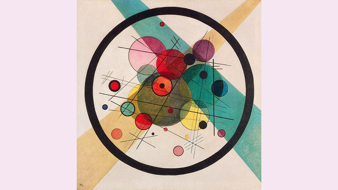
Circles in a Circle by Wassily Kandisky, 1923
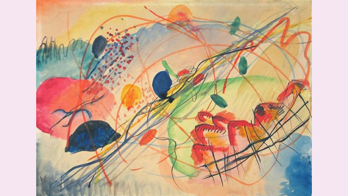
Watercolour #6 by Wassily Kandisky, 1911
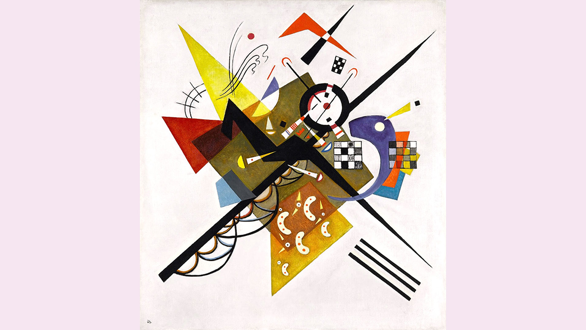
On White II by Wassily Kandinsky, 1923
Image 1: Untitled, Wassily Kandinsky.
A painting with a collection of colours and paint splatters throughout the entire piece in white, red, black, yellow, and blue.
Image 2: Circles in a Circle, Wassily Kandinsky.
A painting with a large, dark circle in the centre. Inside the circle are several overlapping circles of different sizes, colours, and intensities. Two thick stripes, one blue and one yellow, intersect in the background, and many thin black lines intersect inside the circle.
Image 3: Watercolour #6, Wassily Kandinsky.
The painting is made with watercolour paint. There are soft background colours in different shares of blue. There are several thin lines moving across the canvass in almost parallel lines. There are small shapes close together in the foreground underneath the lines.
Image 4: On White II, Wassily Kandinsky.
A painting with different both thick and thin lines crossing in the centre. The lines are mostly straight. There are also shapes like triangles, squares, and grids overlapping in different directions. There is empty white space around the cluster of lines.
Portfolio
Track your progress

Select one of Kandinsky’s pieces and describe it. Consider adding your answers to your art portfolio.
- What do you notice?
- What elements of art are used in this work? How are the elements organized or arranged?
- Can you identify any recognizable objects, scenes, or places?
- What do you think Kandinsky is trying to communicate with their work?
Record your ideas using any method of your choice.
Action
Get ready, get set…
The abstract expressionist movement
In the Minds On section, you explored the work of Wassily Kandinsky. Wassily Kandinsky was a Russian painter and art theorist. He is known for his abstract paintings, which he created in the 1900’s. Kandinsky influenced and inspired the Abstract Expressionist Movement.
Abstract expressionism describes art that was created in the late 1940's after World War 2. Abstract Expressionism began in New York City in the United States and became popular around the world. There is often a spontaneous or emotional feeling to the paintings, as artists abandon traditional expectations and explore diverse styles, expressions, and freedom of technique.
The most prominent Abstract Expressionist painters from this period were Jackson Pollack, Mark Rothko, Willem de Kooning, and Franz Kline. Others included Joan Mitchell, Clifford Still, Helen Frankenthaler and Arshile Gorky.
This artistic movement spread to Canada in the 1950s, where Canadian artists began to make Abstract Expressionist art. Some Canadian abstract artists included Jean-Paul Riopelle, Alexandra Luke, Kazuo Nakamura, and William Ronald.
Did You Know?
Did you know?
Alexandra Luke, Kazuo Nakamura and William Ronald were part of an influential group of artists from Ontario called Painter’s Eleven. These eleven painters were active between 1953 and 1960. Their abstract expressionist paintings are on display in public galleries throughout Canada.
Transmutation by Alexandra Luke, 1952
Morning Mist by Kazuo Nakamura, 1951
Seer by William Ronald, 1960-1961
Image 1: Transmutation by Alexandra Luke.
This abstract piece uses a variety of thick and thin brushstrokes and colour palette that includes browns, yellows, white, light shades of green, orange, and a small amount of red. Shapes are melded together throughout this piece.
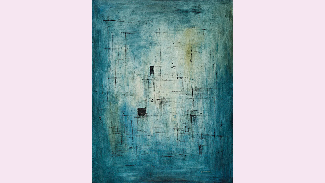
Image 2: Morning Mist, Kazuo Nakamura.
A painting with a muted blue background lightening in shade in the centre. There are a few small black squares close to the centre and some faint, short black lines found sporadically throughout the piece.
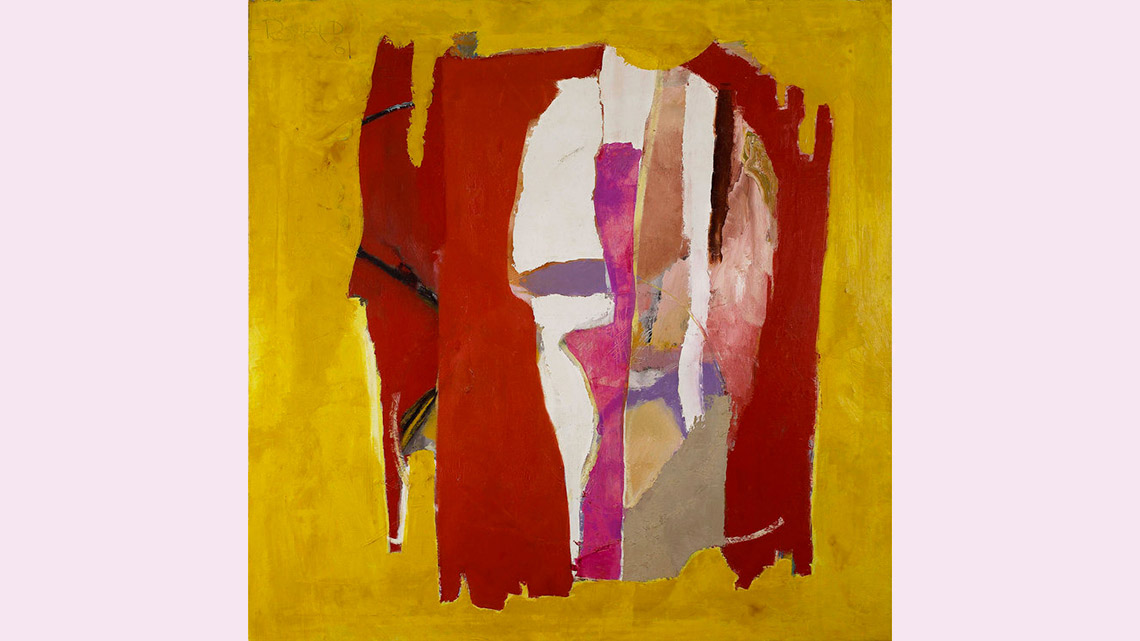
Image 3: Seer, William Ronald.
A painting a yellow background and a large red object in the centre that is almost rectangular shaped. In the middle of the red rectangle there is more colour and a variety of thick and thin sections. These include white, black, purple, and pink.
Let’s explore some of the art that was created during this time and learn about the artists. Press the following tabs to access more information about the artists who worked during that time.
Paul Jackson Pollack was an American artist known for his improvisational style of abstract art which was created by dripping and flinging paint onto a canvass. This style of Action Painting emphasized line and colour over form.
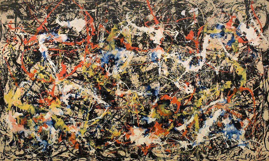
Convergence by Jackson Pollock, 1952
Mark Rothko was an abstract painter of Latvian-Jewish descent. He is known for his Colour Field paintings, where he used blurred outlines and large areas of colour to express himself.
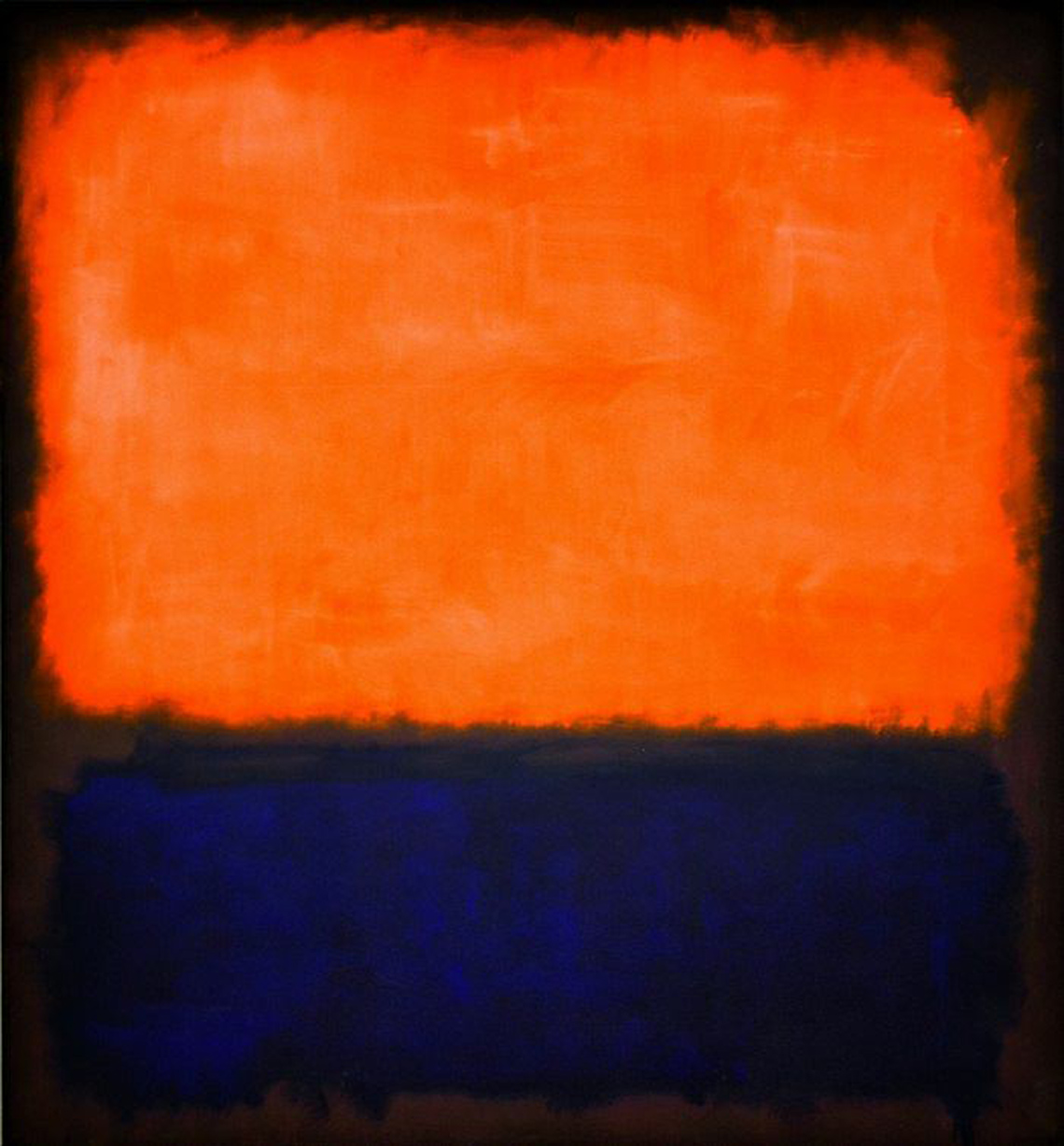
Number 14 by Mark Rothko, 1960
Willem de Kooning is a Dutch-American abstract expressionist painter. He is considered an Action Painter who used paint to create emotional, abstract gestures.
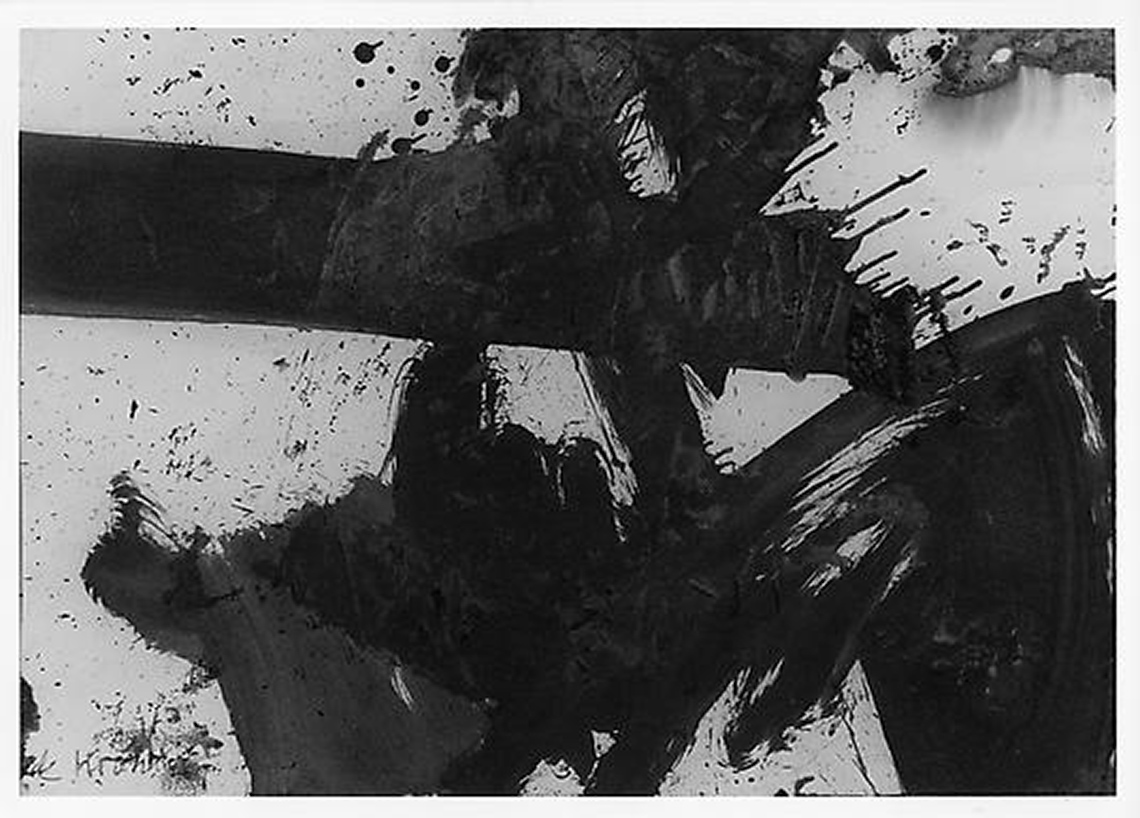
Black and White Side B by Willem de Kooning, 1959
Jean-Paul Riopelle was a painter and sculptor from Quebec. He is best known for his “mosaic” works of the 1950s which he created by using only a palette knife to apply paint to canvas, giving his works a sculptural quality.
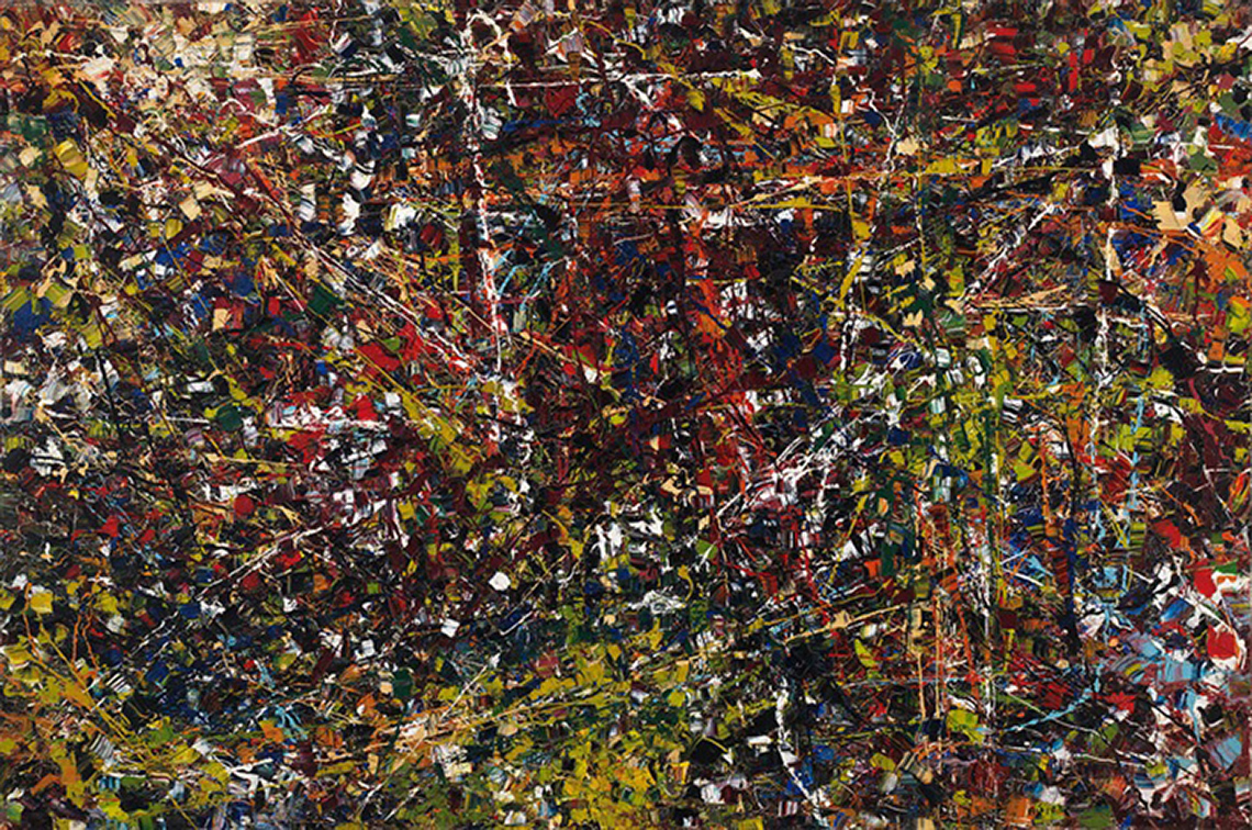
Vent du nord by Jean-Paul Riopelle, 1952-53
Alexandra Luke was born in Montreal, Quebec. In 1952, she organized the first Canadian Abstract Exhibition, where she met many of the members who would later become Painter’s Eleven. In addition to exhibiting as a professional artist, Alexandra Luke was a teacher and helped to create an artistic community in Oshawa, Ontario.
Transmutation by Alexandra Luke, 1952
William Ronald is one of the founding members of Painter’s Eleven, an influential group of abstract painters from Ontario. He graduated from the Ontario College of Art in 1951. William Ronald is also known for his nonrepresentational portraits of Canadian Prime Ministers (1977-1984).
Untitled by William Ronald, 1954
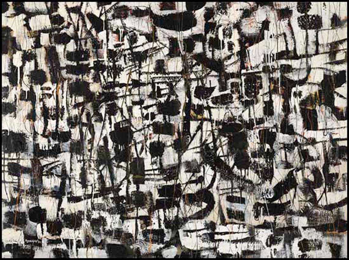
Clifford Still was born in 1904 in Grandin, North Dakota. His work started as realistic images and landscapes and then transitioned to abstract shapes, colours and lines through which he expressed his ideas and feelings on large scale canvases.
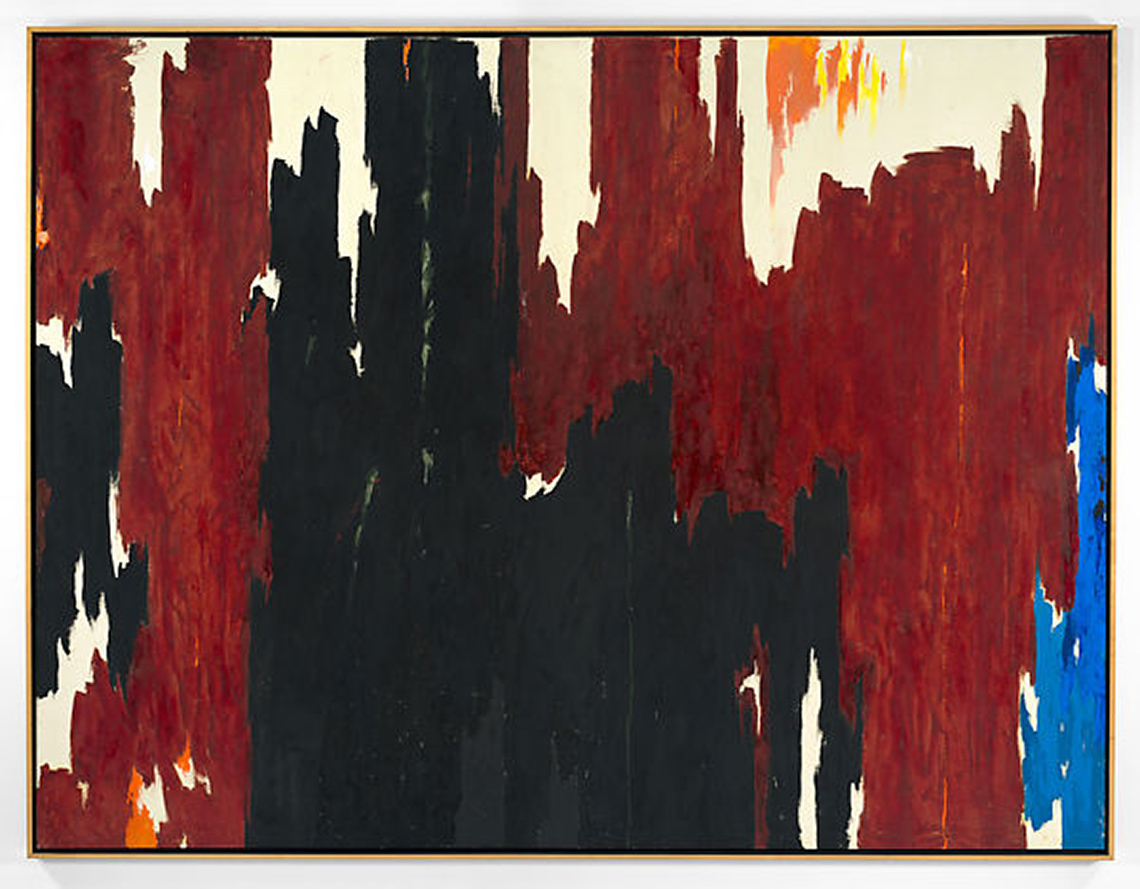
Untitled by Cliffford Still, 1960
This piece is created on a light yellow background. There are large brown, vertical sections reaching from top to bottom. There is a black area intertwined with the brown sections. On the far right is one thin blue, vertical section from the bottom to the midpoint. In the top there is a small orange section.
Connections
Connections
Examine these images along with the Kandinsky images previously explored.
- What are some of the similarities and differences between the styles and techniques used?
- What are the feelings that the artist might be trying to express?
Explain your thinking.
Press ‘Examples’ to access tips for answering the two questions.
Examples of techniques and styles used: splash strokes, geometric and organic shapes, vibrant colours, lines, gesture strokes and textures.
Action painting vs. colour field painting
Abstract expressionism is often characterized by fluid shapes, gestural brush-strokes or mark-making, and can often give the impression of spontaneity. According to the Tate Gallery, there were two broad groupings within abstract expressionism: the action painters and the colour field painters.
Action painting is a style of abstract art that is improvisational and emphasizes the process of painting itself. It is created when paint is spontaneously splashed, thrown, dribbled, smeared or poured onto a canvass.
Colour field paintings is a style of abstract art that emphasizes colour to express emotion. They are often painted on very large canvasses, and are characterized by large areas of solid colour, that overlap and interact.
Based on the description above, can you identify which artists were considered “action painters”? For each piece of art and artist, select whether they are action or colour field painters.
Select the correct answer, then press ‘Check Answer’ to see how you did.
Go!
Artists inspire other artists to create. Let’s learn about two contemporary artists who are creating abstract art in their own style to express themselves.
Marie Manon Corbeil
Marie Manon Corbeil is a contemporary and abstract artist based in Calgary, Canada. She uses large canvasses and vivid acrylic paints to express her feelings. Her art is rich in texture and colour. Marie Manon uses large brushes, finger strokes, marks and scribblings in her work. She often writes positive words under each canvas.
Living in a bubble by Marie Manon Corbeil, 2021
When Life gets you down by Marie Manon Corbeil, 2021
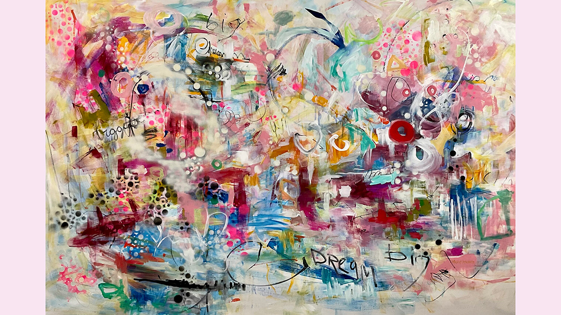
Image 1: Living in a Bubble, Marie Manon Corbeil.
An abstract painting that is colourful, chaotic and expressive. This painting has softer colours: pink, red, light blue, and yellow, with some patches of a dot pattern and written words like "big" and "dream".
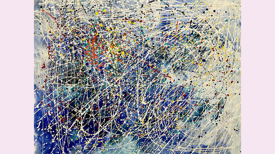
Image 2: When Life Gets You Down, Marie Manon Corbeil.
An abstract painting made with long, thin scribbles and brush strokes primarily in white on a mostly blue background. The strokes and flecks of paint move in all directions across the canvas.
Image 3: Lovely, Marie Manon Corbeil.
An abstract painting with blocks of colours, but the forms are unrecognizable. Red, black, blue, and white are featured most prominently. The brush strokes feel fast, but not frantic.
On her website, Marie Manon describes her creative process:
“My first passion is art, my second is colour. I draw inspiration for my work from my
emotions and how they are ‘stroked’ by people, past and present, the beautiful Canadian
nature surrounding me, the music found in daily chores
and events. Every piece of art is both a struggle and a liberation, sometimes
successful, sometimes not. But always pure.”
–Marie Manon
Pause and Reflect
Pause and reflect
- What inspires you to create?
- Where do you draw inspiration from?
- How would you describe your own creative process?
- What do you think Marie Manon means when she says, “Every piece of art is a struggle and a liberation?”
Press ‘Answer’ to access a possible response to this question.
Manon might mean that the process of creating the artwork can be difficult. There might be times where she gets stuck or needs to rework different sections. But, at the same time that process is freeing and enjoyable because she is able to create and express herself.
Reggie Laurent
Another exciting abstract artist is Reggie Laurent. Explore examples of Reggie Laurent’s work below.
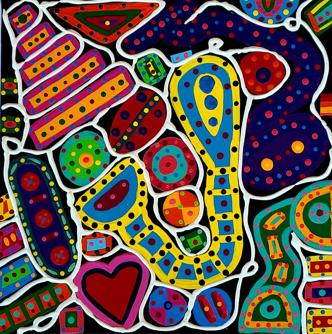
Follow Your Heart by Reggie Laurent
An abstract painting of brightly coloured shapes outlined in white and covered with dots. The shapes are not immediately discernable except for a heart in the bottom left.
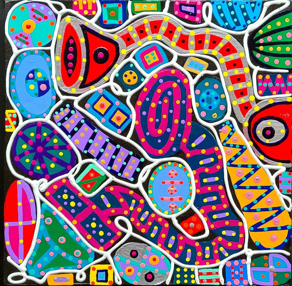
At the Concert by Reggie Laurent
This piece was designed on a black canvas, creating brightly coloured shapes, each with a white outline The colours include blues, red, pink, orange, yellow, green, and purples. This piece is called At The Concert. The shapes in the piece resemble musical instruments such as horns, xylophones, tambourines, drums, and other instruments used in music as well.
Reggie Laurent is a self-taught artist from Chicago, USA. He uses acrylic paint to fill large and small canvasses with detailed designs and bright colours. Reggie often begins with a black canvas and uses a white outline to create organic and inorganic shapes. Then, he fills in the shapes with colour and details. The lines, patterns and designs appear to be dancing.
Reggie describes his creative process:
“The shapes I paint are random and flow off my brush effortlessly as if they are a
language I can write proficiently, but don’t totally understand….Every mood I experience
appears on the canvas via a stroke, colour or shape
that was influenced by the environment in which I create.”
– Reggie Laurent
Pause and Reflect
Pause and reflect
- How would you describe the mood or emotions being expressed in each of Reggie Laurent’s paintings?
- Reggie Laurent uses a kaleidoscope of colours, form and line in his work. How does Reggie Laurent create balance and unity in his paintings?
Press ‘Answer’ to access a possible answer to these questions.
Reggie Laurent creates balance and unity in his paintings through a repetition of similar colours and lines. His use of lines are expressive, twisting and turning to create interesting pathways in his work.
Consolidation
Putting it all together

Now it’s your turn! Using your understanding of abstract expressionism and the work of a specific artist, it’s time to start planning your own piece! Consult the elements and principles of design before you begin. Which elements and principles will you incorporate in your work?
Elements of design
What are the elements of design?
The elements of design are the basic attributes, ideas and parts of artwork that are used to create an artwork. The seven elements are line, shape, colour, value, form, texture and space.
Press the following tabs to check out the elements of design!

A diagram showing various types of lines and examples. Horizontal lines move from side-to-side, vertical lines move up and down, diagonal lines move at a forty-five degree angle, zigzag lines move in a lightning-bolt shape, and curved lines bend and swirl.
Lines are the paths left by a moving point, such as a pencil or a digital drawing tool. A line can be a mark, a guide, or a boundary that leads the audience’s attention in an artwork. Diversity in the type, orientation, and/or quality of lines can be used to suggest a variety of ideas, shapes, or emotions. For example, horizontal and curving lines can feel restful or inactive. Vertical and diagonal lines can create the idea of movement or action. Horizontal and vertical lines can create stability.

A diagram showing various types of shapes. Geometric shapes are traditional shapes like squares, circles, and triangles. Organic shapes are loosely defined and more free-flowing. Positive shapes are filled in their interior, and negative shapes leave an empty space around a shape.
A shape is a form that is enclosed or outlined. For example, when three lines meet they create the shape of a triangle. A shape has length and width. A shape’s boundary can be created by line, value, colour and/or texture. Shapes may be geometric or organic.

A colour wheel with labels. Red, blue, and yellow are primary colours. Green, orange, and purple are secondary colours. Cool colours range from purple to green-yellow, and warm colours range from red-violet to yellow.
In scientific terms, colour is the particular wavelength of light viewed by the eye when an object reflects or emits light. The four characteristics of colour are hue, value, intensity, and temperature. Colour categories include primary, secondary and tertiary. Colours can also be sorted into the temperatures of warm or cool colours. Cool colours include blue, green and purple. Warm colours include red, orange and yellow.

Value is the lightness or darkness in an artwork. Value is created by the gradual changes in the lightness or darkness of an artwork even when colour is absent. Changes in value can be created by adding white or black to a colour and/or by erasing or adding more art medium to an art piece. Value is used to create the illusion of texture and light in art.

Form is the three-dimensional shape and dimensions of an artwork, or objects within an artwork. Form can also mean the illusion of a two-dimensional object being three-dimensional. A shape can appear to be a form with length, width and height by using shading and/or perspective. Forms can be geometric or organic.

Texture is the feeling and appearance of a surface. Texture can be smooth, rough, furry or soft. Texture can be the illusion of texture or real texture.

A diagram of a landscape showing foreground, middle ground, and background. The foreground - a cluster of bushes and ground at the bottom of the image - is closest to the viewer. The middle ground - trees, water, and animals in the middle of the image - is at the mid-point from the viewer. The background - mountains and the sky at the top of the image - are the furthest away from the viewer.
Space can be the area around, inside, or between parts of an artwork. Space can be a physical distance between objects. Space can also be an illusion of distance in a two-dimensional piece. The illusion of space can be created by a variety of techniques, including overlapping parts, a variety of sizes, changing value or colour, the use of detail, and perspective.
Principles of design
What are the principles of design?
The principles of design are the guidelines used to create art. Principles of design are also used to consider what an art piece may mean. The principles of design are contrast, repetition and rhythm, variety, emphasis, proportion, balance, unity and harmony, and movement.
Press the following tabs to explore the principles of design!

Contrast is the use of opposing elements of design in order to highlight their differences and create balance, interest, or a focal point. Contrast is the opposite of unity. For example, contrast can be created by using the opposite values of dark and light. Contrast often creates emphasis in an art piece.

Rhythm uses repeated elements to create movement in an artwork. Repeating elements direct the audience’s attention through the artwork in a set pathway. Rhythm gives a sense of unity to artwork. For example, creating a line of similar shapes create the impression of moving along a path.
Repetition is the repeated use of similar elements and effects in an art piece. The repeated use of an element creates unity in an artwork. Repetition may give attention to one idea. Repetition can create a feeling of harmonious relationship. Repeating one element can also make a pattern or create a rhythmic movement of the audience’s attention. For example, a repeated pattern of similar brushstrokes can lead the audience’s attention through the artwork.

Variety is created by using diverse elements in art for contrast. Variety can be created by using diverse shapes, sizes, colours and textures.

Emphasis is the special importance given to one part or element in an artwork. Emphasis directs the audience’s attention to the chosen element first. Emphasis can be created using design elements such as contrast, colour, and size. For example, a shape can be emphasized by making it contrast and stand out to the audience.

Proportion is the connection between objects and their sizes. Proportion includes the parts of a whole being the right sizes. For example, an image of an outdoor scene with the right proportions between a large building and the smaller people around it would appear to be realistic.

Balance is a principle of design. Balance is when the elements in an art piece create the impression of stability. Balance is created by having equal parts on each side of the art.

Unity means the arrangement of elements to create a sense of wholeness. Unity can be created by using repeated elements or having similar elements. Unity creates a feeling of satisfaction in the audience.
Harmony is created by the use of similar elements. Similar elements can be similar shapes, colours, or themes. Harmony makes the elements fit together. Art with harmony feels balanced.

Movement is the impression of action along a path in an art piece. Elements are used so that the audience’s attention follows a set path. Movement can be created by using lines, edges, shapes, colours, and values. Movement often ends at the most important part of an artwork.
Student Success
Exploring digital creation options
When you are considering digital creation options, explore the variety of digital applications available!
Safety
Before you begin, consider these safety precautions:
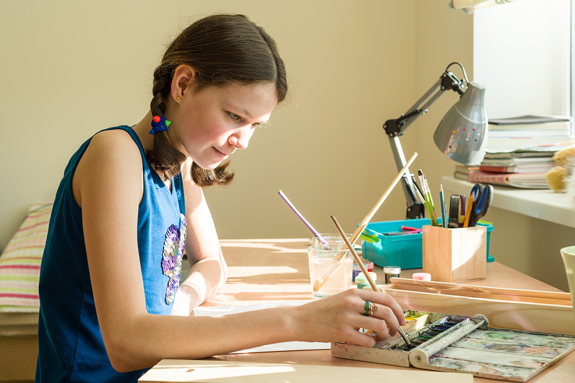
Now it’s your turn to create! Press the following tabs to check out a variety of methods to create your art. Choose one of the following options to try out!
Materials
Materials needed
Possible materials you might need for this learning activity:
- pencil
- paper
- drawing tools
- paint (watercolour or acrylic), paintbrushes and water
- markers
- pencil crayons
- highlighters
Decide which artist and style of abstract art inspires you. Return to the artwork shared in the Minds On and Action section as inspiration. Create an audio, video or written description of your plan and procedure for your abstract art piece.
Create an abstract art piece using a digital application of your choice.
Step 1: Decide which artist and style of abstract art inspires you. Return to the artwork shared in the Minds On and Action section as inspiration.
Step 2: Choose a topic, feeling or idea that you want to express in your art. What will the title be?
Step 3: Consider the abstract stylistic elements that you will use to express yourself..
Step 4: Sketch out your design on your canvas.
Step 5: If using colour, consult and explore the colour wheel to plan your colour scheme (cool, warm, complementary, monochromatic, combination)
Cool colours
Cool colours include blue, green and purple. Cool colours can be associated with the emotions of calmness, relaxation, and sadness. Cool colours give the illusion of moving into the background.
Warm colours
Colours that suggest warmth (e.g., red, yellow, orange). Warm colours usually create the illusion that they advance into the foreground.
Complementary colours
Colours that are directly opposite each other on the colour wheel. The complementary colour for red is green. The complementary colour for yellow is purple. The complementary colour for blue is orange. A secondary colour’s complement is always the primary colour that is not used to create it. For example, because orange is created from red and yellow, its opposite complementary colour is blue. Complementary colours are used next to each other to create contrast and bright areas in artwork.
Monochromatic scheme
A colour scheme in which only one colour or hue is used. The colour’s value can be changed by adding white for lighter values and black for darker values. Tints are lighter values created by adding white to a colour. Shades are darker values created by adding black to a colour.

A colour wheel with yellow, yellow-orange, orange, red-orange, red, red-violet, purple, violet, blue, blue-green, green, yellow-green. Cool colours range from purple to yellow-green, and warm colours range from red-violet to yellow.
Step 6: If you are working with paint, consider how you might add abstract elements such as gestural strokes, markings or splatter techniques to your canvas.
Step 7: If you are using shapes and forms, outline the stylistic features that you would like to emphasize on your canvas.
Share your abstract art piece with a partner, if possible.
Portfolio
Art portfolio
Consider adding your beautiful art and the answers to the following questions to your Art Portfolio. This portfolio can be a folder, on a shelf, or on your computer.
Respond to the following questions and record your ideas using a method of your choice.
- Which artist/artists inspired your piece?
- Which abstract stylistic features did you enjoy creating/drawing the most?
- What would you like to continue to practice as you explore this style of art?
- How does this style of art compare to a more traditional style? Which style do you prefer and why?
Reflection
As you read the following descriptions, select the one that best describes your current understanding of the learning in this activity. Press the corresponding button once you have made your choice.
I feel...
Now, expand on your ideas by recording your thoughts using a voice recorder, speech-to-text, or writing tool.
When you review your notes on this learning activity later, reflect on whether you would select a different description based on your further review of the material in this learning activity.