Minds On
Task 1: True or false?
For the following statements, decide whether they are true or false. Select the correct answer, then press ‘Check Answer’ to see how you did.
Task 2: Exploring density maps
Explore the following population density map and world map.
- What areas of the world do you believe to have the highest human population?
- Which countries are scarcely populated?
- How did you know?
Record your ideas in a notebook or a method of your choice.

This is a map of the world. Along the base of the map there is a legend which uses colours changing from nine categories of light to dark purple to represent population density of how many people there are for every kilometre squared. The lightest colour represents the least people per kilometer squared, and as the colour becomes darker it represents the increasing population density. The first lightest category is zero to ten people per kilometre squared. The lightest colour includes the continents Australia and Antarctica, and the countries Russia, Canada and Bolivia. Countries with large amounts of land, or countries located close to the northern and southern poles usually are included in this category. The second lightest category is ten to twenty-five people per kilometre squared. The second category includes countries in South America such as Argentina, Paraguay and Uruguay. It also includes northern European countries such as Sweden, Norway and Finland. Several countries in the African continent are also included, such as Niger, Algeria and Sudan. The third light category is twenty-five to fifty people per kilometre squared. It represents some countries like the United States, much of South America such as Brazil, Chile, and Peru; and many countries in Africa including Eritrea, Zimbabwe and Mozambique. The fourth category is a medium-light purple colour and represents fifty to seventy-five people per kilometre squared. This category includes Mexico, Ireland and the Ukraine, as well as some of the northern countries of South American such as Panama and Ecuador. The fifth category a medium purple and is seventy-five to one hundred people per kilometre squared. Many central European countries fall into this category, such as Spain, Serbia, Albania, and Greece. The sixth category is medium-dark purple is one hundred to one hundred and fifty people per kilometre squared. Several Asian and Southeast Asian countries are included, such as China, Indonesia, and Thailand. A number of European countries also qualify for this category, such as Poland, France, Portugal and Austria. The seventh category is one hundred and fifty to three hundred people per kilometres squared. Some examples of countries in this category are Italy, Germany, Pakistan, the United Kingdom and Vietnam. The eighth category is dark purple and is three hundred to one thousand people per square kilometre. Countries in this category are located closer to the equator and often are countries with smaller amounts of land such as islands. Countries in this category include Japan, the Philippines, India, South Korea, and the Netherlands. The ninth and final category is any countries with more than one thousand people for every square kilometre. As of 2006, there are less than 15 countries in this category. Examples of countries in this category include Hong Kong, Bangladesh, and Singapore.

Action
Task 1: Settlement patterns

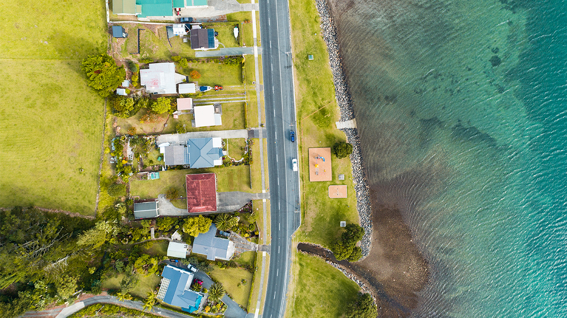
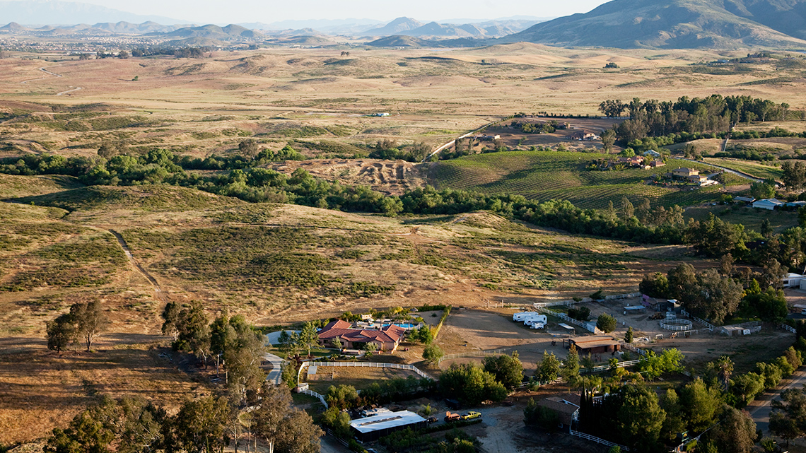
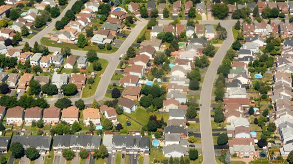
There are three main population settlements that are commonly found: linear, scattered, and clustered.
For the following settlements, select the corresponding image.
Identifying settlement patterns
Explore the following images of settlements taken from an aerial view. Identify each one as linear, scattered, or clustered.

Press ‘Answer’ to access the correct settlement pattern.

Press ‘Answer’ to access the correct settlement pattern.

Press ‘Answer’ to access the correct settlement pattern.
Task 2: Density

Population density is the average number of people who live in a square kilometer of land. It is calculated by dividing the population of a country by its area. A country’s population is classified in one of three following categories:
- Sparse: Less than 15 people per square kilometer. These countries have a small population in comparison to their land area.
- Moderate: Density is 15 to 149 people per square kilometer. These countries populations are considered medium in comparison to their land area.
- Dense: Density has more than 150 people per square kilometer. These countries have less land in comparison to their large population.
How to calculate population density
There are four steps to calculate population density.
- Step 1 – Enter the total population of a country into a calculator.
- Step 2 – Divide by the total area of the same country.
- Step 3 – Round your number to the nearest whole number.
- Step 4 – Compare the number you found to the three population density categories of sparse, moderate, and dense. Choose which category is correct based on the number you calculated!
Record your calculations and thoughts in a notebook or another method of your choice.
Press ‘Example’ to reveal an example of how to calculate population density.
For example, the population of China is 1,357,000,000 and the area (km²) is 9,597,000.
We will use the following four steps to calculate the population density.
- Step 1 – Enter the population – 1,357,000,000 – into the calculator.
- Step 2 – Divide by area – 1,357,000,000 ÷ 9,597,000 = 141.39835
- Step 3 – Round your number to the nearest whole number = 141
- Step 4 – Compare the number you found to the densities above. Therefore 141 = moderate.
Be sure to double check the number of zeros you are adding. Missing a zero or adding an extra zero will dramatically change the information!
Let’s practice!
Conduct research to find the populations of the following countries. The area (km2) has been provided for you and the first one is completed to show you an example.
Remember that population is divided by area (km2).
Begin your research by exploring world databases or government databases.
Complete the Population Density Around the World chart in your notebook or using the following fillable and printable document. You can also use another method of your choice.
| Country | Population | Area (km2) | Population Density | Is it sparse, moderate, dense? |
|---|---|---|---|---|
| China | 1,357,000,000 | 9,597,000 | 141 | Moderate |
| India | 3,287,000 | |||
| United States | 9,834,000 | |||
| Canada | 9,985,000 | |||
| Finland | 338,424 | |||
| Sweden | 447,435 |
Press the ‘Activity’ button to access the Population Density Around the World.
Where does Canada fall in terms of population density? Sparse, moderate, or dense? Does this surprise you? Why or why not?
Record your ideas in a notebook or a method of your choice.
Press ‘Answers’ to access Canada’s population density.
Reading Time
Canada’s population
After exploring the article, respond to the following questions:
1. What are some of the concerns about Canada’s population?
Press ‘Hint’ to access a possible concern.
2. What does the article propose that could help with the current population situation?
Record your ideas in a notebook or a method of your choice.
Task 3: Choropleth maps
A choropleth map uses colours and/or patterns to give specific information about demographics.
Demographics is defined as the study of the population and the people of a specific area.
You might explore a choropleth map for information about: population densities, average incomes, average age, voting preferences, etc. Choropleth maps are used because they are clear and show a full representation of a desired measurement across a specific region.
Examine the following choropleth maps. While exploring each map, consider the following:
- What features do you notice when exploring the choropleth map?
- What type of information is conveyed in a legend of a choropleth map?
- Why is it important to explore the legend carefully before trying to interpret the map?
- Why would it be more appropriate to depict a pattern on a choropleth map rather than trying to describe it in writing?
- Record one piece of information you can gather from each of the maps.
Population density in the United States

This is a map of the United States. Each state is a different colour that corresponds to a legend with a density scale. The density scale has eight categories and colours. The darkest red is 1,000+ people per square kilometer. The middle red is 500 to 1,000. The light red is 200 to 500. The dark orange is 100 to 200. The middle orange is 50 to 100. The light orange is 50 to 20. The dark beige is 10 to 20. The light beige is 0 to 10. Most of the eastern states are middle to dark red, as well as California. The rest of the states are between light orange to light beige.
This is a choropleth map of the United States that depicts population density. On the right-hand side, there is a legend that uses a density scale. The density scale starts with darkest red at 1,000 people per square kilometer plus and gradually changes to a white/beige colour that depicts states that are 0-10 people per square kilometer.
Do you notice a trend in most of the eastern states that is different than the other states?
Carbon dioxide emissions around the world

This is a world map that depicts the per capita CO2 emissions in 2010. The legend at the bottom depicts what each colour represents. There are seven colours going from dark blue to white. Dark blue is 25.00+. Middle dark blue is 20.00 to 24.99. Middle blue is 15.00 to 19.99. Middle light blue is 10.00 to 14.99. Light blue is 5.00 to 9.99. Light grey is 1.00 to 4.99. White is 0.00 to 0.99. Canada, the United States, Greenland, and Australia are all a darker colour, representing 20.00 to 24.99 CO2 emissions. Saudi Arabia, Libya, Russia and China are all slightly lighter, representing 10.00 to 19.99 emissions. Several areas such as Mongolia, Norway, Sweden, Denmark, France, and southern parts of Africa are slightly lighter representing 5.00 to 14.99 CO2 emissions. The rest of Africa, and Brazil are lighter, representing 0.00 to 4.99 emissions.
This is a world map that depicts the per capita carbon dioxide emissions in 2010. Carbon dioxide is sometimes referred to with the acronym CO2. The legend in the bottom left corner depicts what each colour represents. The lighter colours represent 0.00 to 0.99 emissions, and the darker colours represent up to 25.00+ emissions.
Population living in urban areas

This map depicts the percentage of population living in urban areas in countries around the world in 2016. The legend uses a gradient of colour from light red to dark red to represent zero percent as the lightest red and 100 percent as the darkest red. The majority of the world, including North America, Greenland, Brazil, Mexico, Russia, Australia and some northern parts of Africa are all darker red, representing a higher percentage of the population living in urban areas. China and some central areas of Africa are lighter, representing 50 percent of the population living in urban areas. A few areas left in Africa and India show a smaller percentage living in urban areas.
This map depicts the percentage of population living in urban areas in countries around the world in 2016.
The scale at the bottom goes from zero percent of population in urban areas with a light colour to 100 percent of population living in urban areas being the darkest red.
Let’s record our findings!
After exploring the choropleth maps, respond to two of the questions in the following Exploring Choropleth Maps activity in your notebook or usa the following fillable and printable document. You can also use another method of your choice.
| Exploring Choropleth Maps | Choose two questions to answer! |
|---|---|
| What features do you notice when exploring a choropleth map? | |
| What type of information is conveyed in a legend of a choropleth map? | |
| Why is it important to explore the legend carefully before trying to interpret the map? | |
| Why would it be more appropriate to depict a pattern on a choropleth map rather than trying to describe it in writing? |
Press the ‘Activity’ button to access the Exploring Choropleth Maps.
Consolidation
Multiple choice
Consider what we have learned about population density, settlements, and choropleth maps in the previous sections.
Select the correct answer, then press ‘Check Answer’ to see how you did.
Let's review!
- What is the difference between population density and population distribution?
- How do choropleth maps convey information? Do you find this type of map easy to interpret? Why or why not?
Record your ideas in a notebook or a method of your choice.
Reflection
As you read the following descriptions, select the one that best describes your current understanding of the learning in this activity. Press the corresponding button once you have made your choice.
I feel...
Now, expand on your ideas by recording your thoughts using a voice recorder, speech-to-text, or writing tool.
When you review your notes on this learning activity later, reflect on whether you would select a different description based on your further review of the material in this learning activity.
