Minds On
Visual representations of data
Explore the poster about maple syrup below and think about the following questions:
- What features does this poster have?
- What information does it provide?
- Do you think this is an effective way to display data?
Throughout this learning activity, you can record your thoughts digitally, orally, or in print.
Maple syrup infographic
 Description
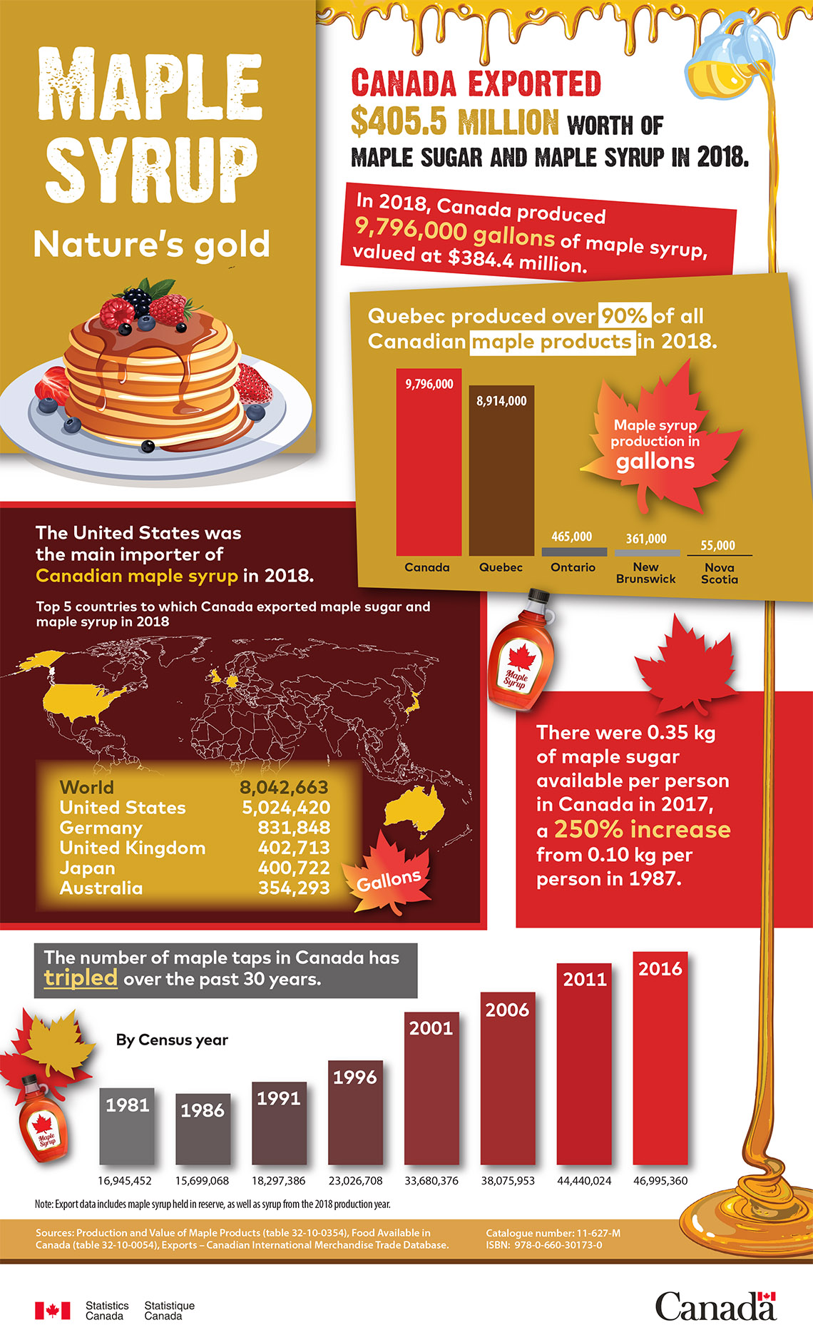
A poster with a gold box in the top left corner that contains the title Maple Syrup: Nature’s gold. Under the title is an image of a stack of pancakes with berries and syrup on top. Drips of syrup line the top edge of the poster and a jug pouring maple syrup is in the top right corner. The syrup pouring from the jug goes down the right side of the poster behind text boxes. The syrup gathers in a pool in the bottom left corner.
Text in the top right corner next to the jug states: “Canada exported $405,500,000 worth of maple sugar and maple syrup in 2018.” “Canada exported” is written in a larger red font, and “$405,500,000” is written in a larger gold font.
Below is a red box angled downwards to the right that contains the text: “In 2018, Canada produced 9,796,000 gallons of maple syrup, valued at $384,400,000.” “9,796,000 gallons” is bolded in gold.
Below is a gold box that contains a bar graph underneath the text: “Quebec produced over 90% of all Canadian maple products in 2018.” “90%,” and “maple products” are highlighted. From left to right, the bar graph has five bars labelled “Canada; 9,796,000,” “Quebec; 8,914,000,” “Ontario; 465,000,” “New Brunswick; 361,000,” and “Nova Scotia; 75,000.” Above the 3 last bars, which are very small, there is a maple leaf that contains the text: “Maple syrup production in gallons.”
On the left side of the poster below the image of pancakes is a brown box with a red border that contains the text: “The United States was the main importer of Canadian maple syrup in 2018.” “Canadian maple syrup” is written in gold. Below is the text: “The top 5 countries to which Canada exported maple sugar and maple syrup in 2018” written above a line drawn world map that has 6 countries coloured yellow. The bottom of the map is covered by a gold box containing a table with the text: “World; 8,042,653,” “United States; 5,024,420,” “Germany; 831,848,” “United Kingdom; 402,713,” “Japan; 400,722,” “Australia; 354,293.” Next to the bottom left corner of the gold box is a maple leaf containing the text “Gallons.”
To the right of the brown box is a red box that contains the text: “There were 0.35 kilograms of maple sugar available per person in Canada in 2017, a 250% increase from 0.10 kilograms per person in 1987.” “250% increase” written in gold. At the top of the red box is a bottle of maple syrup and a maple leaf.
Below the brown box there is a grey box that contains the text: “The number of maple taps in Canada has tripled over the past 30 years.” “Tripled” is written in gold and underlined. Across the bottom of the page below the grey and red boxes is a bar graph. From left to right, the bar graph has 8 bars labelled “1981; 16,945,252,” “1986; 15,690,068,” “1991; 18,297,386,” “1996; 23,026,708,” “2001; 30,608,327,” “2006; 30,075,953,” “2011; 44,440,024,” “2016; 46,995,360.” The bars are a gradient of colours: the leftmost bar is grey and the rightmost bar is red. The text “By Census year” is written above the shorter bars on the left side of the graph. To the left of bar graph is an image of a bottle of maple syrup and two maple leaves. Below the bar graph is the text “Note: Export data includes maple syrup held in reserve, as well as syrup from the 2018 production year,” in a very small font.
Below the bar graph is a gold bar spanning the bottom width of the poster that contains the text: “Sources: Production and Value of Maple Products (table 32-10-0354), Food Available in Canada (table 32-10-0054), Exports- Canadian International Merchandise Trade Database,” in a very small font.
In the bottom left corner of the poster there is a Canadian flag beside the text “Statistics Canada, Statistique Canada.” In the bottom right corner of the poster is the text “Canada” with a small Canadian flag above the last letter.
Action
Infographics
An infographic is a visual representation of data that is intended to make the data easy to understand. Infographics may include some combination of charts, diagrams, illustrations, and text, along with graphic design elements.
The parts of an infographic
Different infographics may have different parts, but most infographics will have these parts:
- Title: The title identifies what the topic of the infographic is.
- Focus: All of the data and images are related to the topic.
- Accuracy All of the data is correct and connected to the topic.
- Attractiveness: All of the images are interesting and support the topic.
- Sources: The sources identify where the data came from.
Comparing infographics
Using the tool of your choice, compare and contrast the maple syrup infographic from our Minds On activity to the bilingualism infographic below by answering the following questions:
- What are the similarities and differences between the infographics?
- How does each infographic represent its data?
- What kind of images do the infographics use?
- What story does each infographic tell?
Description
A poster with a gold box in the top left corner that contains the title Maple Syrup: Nature’s gold. Under the title is an image of a stack of pancakes with berries and syrup on top. Drips of syrup line the top edge of the poster and a jug pouring maple syrup is in the top right corner. The syrup pouring from the jug goes down the right side of the poster behind text boxes. The syrup gathers in a pool in the bottom left corner.
Text in the top right corner next to the jug states: “Canada exported $405,500,000 worth of maple sugar and maple syrup in 2018.” “Canada exported” is written in a larger red font, and “$405,500,000” is written in a larger gold font.
Below is a red box angled downwards to the right that contains the text: “In 2018, Canada produced 9,796,000 gallons of maple syrup, valued at $384,400,000.” “9,796,000 gallons” is bolded in gold.
Below is a gold box that contains a bar graph underneath the text: “Quebec produced over 90% of all Canadian maple products in 2018.” “90%,” and “maple products” are highlighted. From left to right, the bar graph has five bars labelled “Canada; 9,796,000,” “Quebec; 8,914,000,” “Ontario; 465,000,” “New Brunswick; 361,000,” and “Nova Scotia; 75,000.” Above the 3 last bars, which are very small, there is a maple leaf that contains the text: “Maple syrup production in gallons.”
On the left side of the poster below the image of pancakes is a brown box with a red border that contains the text: “The United States was the main importer of Canadian maple syrup in 2018.” “Canadian maple syrup” is written in gold. Below is the text: “The top 5 countries to which Canada exported maple sugar and maple syrup in 2018” written above a line drawn world map that has 6 countries coloured yellow. The bottom of the map is covered by a gold box containing a table with the text: “World; 8,042,653,” “United States; 5,024,420,” “Germany; 831,848,” “United Kingdom; 402,713,” “Japan; 400,722,” “Australia; 354,293.” Next to the bottom left corner of the gold box is a maple leaf containing the text “Gallons.”
To the right of the brown box is a red box that contains the text: “There were 0.35 kilograms of maple sugar available per person in Canada in 2017, a 250% increase from 0.10 kilograms per person in 1987.” “250% increase” written in gold. At the top of the red box is a bottle of maple syrup and a maple leaf.
Below the brown box there is a grey box that contains the text: “The number of maple taps in Canada has tripled over the past 30 years.” “Tripled” is written in gold and underlined. Across the bottom of the page below the grey and red boxes is a bar graph. From left to right, the bar graph has 8 bars labelled “1981; 16,945,252,” “1986; 15,690,068,” “1991; 18,297,386,” “1996; 23,026,708,” “2001; 30,608,327,” “2006; 30,075,953,” “2011; 44,440,024,” “2016; 46,995,360.” The bars are a gradient of colours: the leftmost bar is grey and the rightmost bar is red. The text “By Census year” is written above the shorter bars on the left side of the graph. To the left of bar graph is an image of a bottle of maple syrup and two maple leaves. Below the bar graph is the text “Note: Export data includes maple syrup held in reserve, as well as syrup from the 2018 production year,” in a very small font.
Below the bar graph is a gold bar spanning the bottom width of the poster that contains the text: “Sources: Production and Value of Maple Products (table 32-10-0354), Food Available in Canada (table 32-10-0054), Exports- Canadian International Merchandise Trade Database,” in a very small font.
In the bottom left corner of the poster there is a Canadian flag beside the text “Statistics Canada, Statistique Canada.” In the bottom right corner of the poster is the text “Canada” with a small Canadian flag above the last letter.
Use your answers to complete the Comparing Infographics Venn Diagram in your notebook or using the following fillable and printable document.
Press the ‘Activity’ button to access Comparing Infographics Venn Diagram.
Bilingualism infographic
 Description
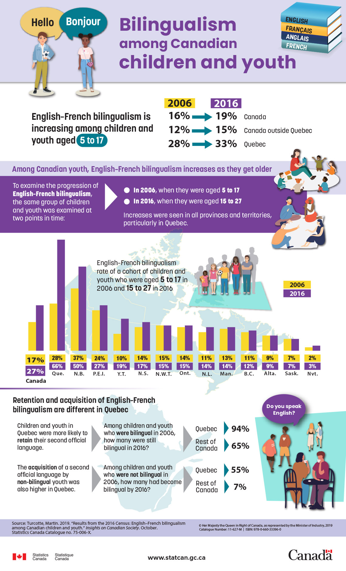
A poster with a purple bar at the top containing the title: Bilingualism among Canadian children and youth. To the left of the title are two youth characters with their own speech bubbles. The character on the left is saying “Hello” and the character on the right is saying “Bonjour.” To the right of the title is an image of four stacked books: the first book is blue and is labelled English; the second book is yellow and is labelled Français; the third book is dark blue and is labelled Anglais;em> and the fourth book is green and is labelled French.
Below the purple bar are two columns.The column on the left contains the text: “English-French bilingualism is increasing among children and youth aged 5 to 7.” “5 to 17” is highlighted. The column on the right is a table that contains the following data: From 2006 to 2016, English-French bilingualism increased from 16% to 19% in Canada; from 12% to 15% in Canada outside Quebec; and from 28% to 33% in Quebec.
Below these columns are a light purple box on top of a dark purple box. The light purple box contains the text: “Among Canadian youth, English-French bilingualism increases as they get older.” On the right side of the light purple box is an image of a teacher sitting in a circle with five children. The dark purple box has two columns. The column on the left contains the text: “To examine the progression of English-French bilingualism, the same group of children and youth was examined at 2 points in time.” A big white arrow between the columns points to the right. The column on the right contains the following two bullet points: “In 2006, when they were aged 5 to 17” and “In 2016, when they were aged 15 to 27.” Below the bullet points is the text: “Increases were seen in all provinces and territories, particularly in Quebec.” On the right side of the dark purple box is an image of a group of young adults sitting in a circle.
Below the purple boxes is a double bar graph underneath the text: “English-French bilingualism rate of a cohort of children and youth who were aged 5 to 17 in 2006 and 15 to 27 in 2016.” To the right of the text is an image of five people that increase in height and age starting with a short child on the left and ending with a tall adult on the right. To the right of the image is a legend for the double bar graph noting that yellow bars represent the year 2006 and that purple bars represent the year 2016. From left to right, the graph contains fourteen distinct sets of double bars labelled: “Canada: 17% in 2006, 27% in 2016;” “Quebec: 28% in 2006, 66% in 2016;” “New Brunswick: 37% in 2006, 50% in 2016;” “Prince Edward Island: 24% in 2006, 27% in 2016;” “Yukon Territory: 10% in 2006, 19% in 2016;” “Nova Scotia: 14% in 2006, 17% in 2016;” “North West Territories: 15% in 2006, 15% in 2016; “Ontario: 14% in 2006, 15% in 2016;” “Newfoundland: 11% in 2006, 14% in 2016;” “Manitoba: 13% in 2006, 14% in 2016;” “British Columbia: 11% in 2006, 12% in 2016;” “Alberta: 9% in 2006, 9% in 2016;” “Saskatchewan: 7% in 2006, 7% in 2016;” “Nunavut: 2% in 2006, 3% in 2016.” The background behind the graph, text, and image is a map of Canada.
Below the graph are two rows of information beneath the text: “Retention and acquisition of English-French bilingualism are different in Quebec.” The first row of information has three columns and the first column contains the text “Children and youth in Quebec were more likely to retain their second official language.” “Retain” is bolded. A big grey arrow between the first and second column points to the right. The second column contains the text: “Among children and youth who were bilingual in 2006, how many were still bilingual in 2016?” “Were bilingual” is bolded. A big grey arrow between the second and third column points to the right. The third column contains the text: “Quebec,” with a small blue arrow point right toward the number “94%,” and “Rest of Canada,” with a small blue arrow pointing right toward the number “65%. The second row of information has three columns and the first column contains the text “The acquisition of a second official language by non-bilingual youth was also higher in Quebec.” “Acquisition” and “non-bilingual” are bolded. A big grey arrow between the first and second column points to the right. The second column contains the text: “Among children and youth who were not bilingual in 2006, how many had become bilingual by 2016?” “Were not bilingual” is bolded. A big grey arrow between the second and third column points to the right. The third column contains the text: “Quebec,” with a small blue arrow point right toward the number “55%,” and “Rest of Canada,” with a small blue arrow pointing right toward the number “7%.” The background behind the rows of information is a map of Quebec. To the right of the rows of information are three images of different pairs of people talking. The first image is of two youth facing each other with a speech bubble coming out of one youth containing the text “Do you speak English.” The second image is of two youth walking and talking together. The third image is of two adults sitting at a table drinking coffee.
Below the rows of information is a purple bar spanning the bottom width of the poster that contains two columns. The first column contains the text: “Source: Turcotte, Martin. 2019. ‘Results from the 2016 Census: English-French bilingualism among Canadian children and youth.’ Insights on Canadian Society. October. Statistics Canada Catalogue no. 75-006-X.” in a very small font. The second column contains the text: “Copyright Her Majesty the Queen in Right of Canada, as represented by the Minister of Industry, 2019.”
In the bottom left corner of the poster there is a Canadian flag beside the text “Statistics Canada, Statistique Canada.” In the bottom centre is the text: “www.statcan.gc.ca.” In the bottom right corner of the poster is the text “Canada” with a small Canadian flag above the last letter.
Design your own infographic
You are now going to design your own infographic representing the topic of your choice.
Follow these three steps:
| Step 1 |
Choose a topic or issue of intest. For example, why do we sleep? Or, how much water do people use during a day? |
|---|---|
| Step 2 |
Collect data about the topic you have chosen. Make sure that you collect data that can be represented in tables and in graphs. |
| Step 3 |
Design your infographic. Create a rough description of how you want to represent the data that you have collected. Record your ideas using the tool of your choice. |
As you work on your infographic design, think about the key parts of the maple syrup and bilingualism infographics that we have already explored. Ask yourself the following questions:
- What data will you include? What data can be left out?
- What data representations will work best to represent the data I want to share?
- What layout will work best to represent the data I want to share?
- Have I included a table and a graph as part of my infographic?
Consolidation
Reflecting on your infographic design

Using the tool of your choice, record a reflection on your infographic design by responding to the following questions:
- What story does your infographic tell?
- How did you organize your data and images in a way that helps people understand the information?
- What are the most important things to think about when you design an infographic?
- What advice would you give to other students who are learning about representing data?
Analyzing an infographic
Using the tool of your choice, analyze the household tasks infographic below by answering the following questions:
- What is the purpose of this infographic?
- What makes it easy to understand?
- What makes it hard to understand?
- How could you improve the way this infographic represents data?
Household tasks infographic
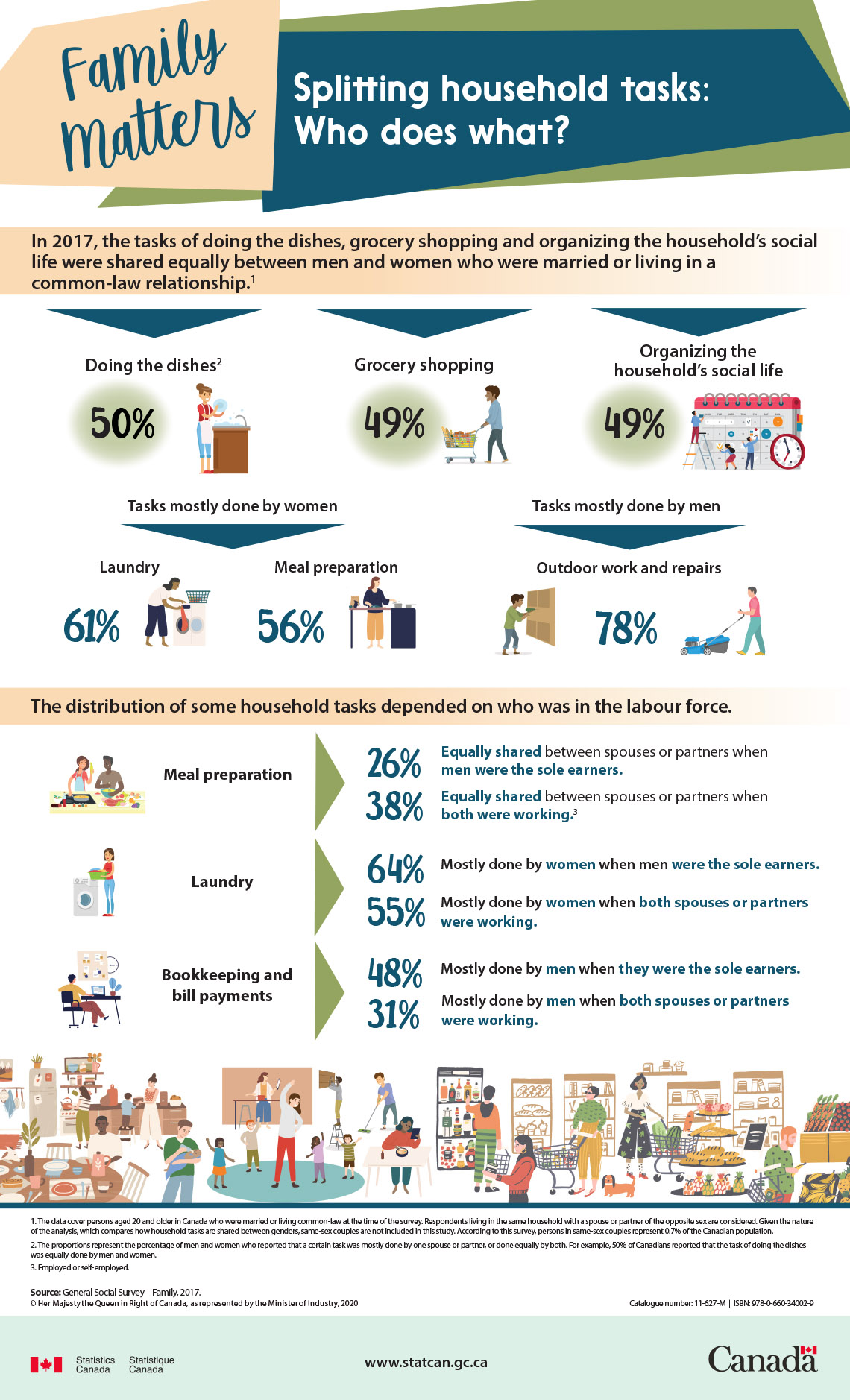
A poster with a yellow quadrilateral in the top left corner containing the title: Family Matters written in cursive. To the right is a long blue quadrilateral that contains the subtitle: “Splitting the household tasks: Who does what?”
Below the quadrilaterals is a yellow bar spanning the width of the poster that contains the text: “In 2017, the tasks of doing the dishes, grocery shopping and organizing the household’s social life were shared equally between men and women who were married or living in a common-law relationship.
Below the yellow bar are three equally spaced large blue arrows pointing down towards three distinct sets of text and images. The arrow on the left points to an image of a person doing dishes next to the text: “Doing the dishes, 50%.” The arrow in the middle points to an image of a person pushing a grocery cart nest to the text: “Grocery shopping, 49%.” The arrow on the right points to an image of tiny adults placing icons on a giant calendar with a giant clock next to the text: “Organizing the household’s social life, 49%.
Below the sets of images are two equally spaced large blue arrows pointing down towards three distinct sets of text and images. The arrow on the left is labelled: “Tasks mostly done by women,” and points to both an image of a woman doing laundry next to the text: “Laundry, 61%,” and an image of a woman cooking next to the text “Meal preparation, 56%.” The arrow on the right is labelled “Tasks mostly done by men,” and points to and image of a man drilling into a wall and an image of a man pushing a lawnmower next to the text “Outdoor work and repairs, 78%.”
Below the sets of images is a yellow bar spanning the width of the poster that contains the text: “The distribution of some household tasks depended on who was in the labour force.”
Below the yellow bar are three rows of information. The first row of information has two columns and the first column contains the text: “Meal preparation” to the right of an image of a woman and man cooking. A large green arrow between the first and second column points to the right. The second column contains the text “26% Equally shared between spouses or partners when men were the sole earners,” above the text “38% Equally shared between spouses or partners when both were working.” “Equally shared,” “men were the sole earners,” and “both were working” is bolded in blue. The second row of information has two columns and the first column contains the text: “Laundry” to the right of an image of a woman doing laundry. A large green arrow between the first and second column points to the right. The second column contains the text “64% Mostly done by women when men were the sole earners,” and “55% Mostly done by women when both spouses or partners were working.” “Women,” “were the sole earners,” and “both spouses or partners were working” is bolded in blue. The third row of information has twoss columns and the first column contains the text: “Bookkeeping and bill payments” to the right of an image of a man sitting at a desk using a computer. A large green arrow between the first and second column points to the right. The second column contains the text “48% Mostly done by men when they were the sole earners,” and “31% Mostly don’t by men when both spouses or partners were working.” “Men,” “they were the sole earners,” “and “both spouses or partners were working” is bolded in blue.
Below the rows of information are many different decorative images spanning the width of the poster. From left to right, these images include adults and children cooking in the kitchen, eating at the dinner table, working, cleaning, organizing, and grocery store shopping.
Below the decorative images is a list of notes containing the text: “1. The data cover persons aged twenty and older in Canada who were married or living common-law at the time of the survey. Respondents living in the same household with a spouse or partner of the opposite sex are considered. Given the nature of the analysis, which compares how household tasks are shared between genders, same-sex couples are not included in this study. According to this survey, persons in the same-sex couples represent 0.7% of the Canadian population. 2. The proportions represent the percentage of men and women who reported that a certain task was mostly done by one spouse or partner, or done equally by both. For example, 50% of Canadians reported that the task of doing the dishes were equally done by men and women. 3. Employed or self-employed.”
Below the notes is the text: “Source: General Social Survey – Family, 2017. Copyright Her Majesty the Queen in Right of Canada, as represented by the minister of Industry, 2020.”
A blue bar spans the bottom with of the poster. In the bottom left corner there is a Canadian flag beside the text “Statistics Canada, Statistique Canada.” In the centre is the text: “www.statcan.gc.ca.” In the bottom right corner is the text “Canada” with a small Canadian flag above the last letter.
Reflection
As you read through these descriptions, which sentence best describes how you are feeling about your understanding of this learning activity? Press the button that is beside this sentence.
I feel…
Now, record your ideas using a voice recorder, speech-to-text, or writing tool.
Press ‘Discover More’ to extend your skills.
Discover MoreHow Should I Represent Data?
Review the four following topics and choose the type of data representation you would use if you were making an infographic. Use the tool of your choice to record your thinking.
- How has the number of students in grade seven changed over the last ten years?
- What modes of transportation do people use for their daily commute to work?
- Which animal do doctors, dentists, and nurses prefer to have as a pet?
- What is the length of the world’s longest pencil?
Connect with a TVO Mathify tutor
Think of TVO Mathify as your own personalized math coach, here to support your learning at home. Press ‘TVO Mathify’ to connect with an Ontario Certified Teacher math tutor of your choice. You will need a TVO Mathify login to access this resource.
TVO Mathify (Opens in a new tab)