Minds On
What story does this data tell?
Student Success
Think-Pair-Share
Throughout this learning activity, you can record your thoughts digitally, orally, or in print.
- What information and data does this poster share?
- What audience do you think this poster is intended for?
- What pictures, charts and images (called data visualizations) are used? What purpose do they have?
- Do you think it is an effective way to display data?
If possible, share your responses with a partner, or a family member.
Note to teachers: See your teacher guide for collaboration tools, ideas and suggestions.
 Description
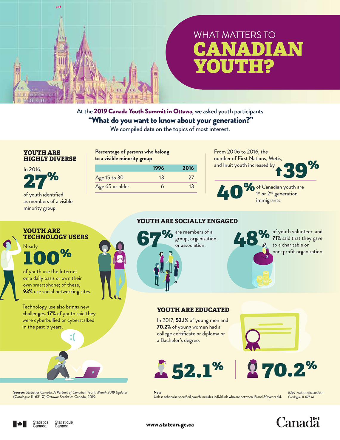
There is an infographic titled, What Matters to Canadian Youth? To the left of the title, there is a picture of the Canadian Parliament Buildings in Ottawa, Ontario. Below the title, there is text that reads, “At the 2019 Canada Youth Summit in Ottawa, we asked youth participants, “What do you want to know about your generation?” We compiled data on the topics of most interest.”
This infographic has three sections.
First section:
In the first section, there is some text, statistics in the form of percentages and a table.
Moving left to right, there is a heading that reads, “Youth are highly diverse.” Below the heading, there is text that reads, “In 2016, 27% of youth identified as members of a visible minority group.”
To the right of this text there is a table. The title of the table is, “Percentage of persons who belong to a visible minority group.” The data shows the percentage of persons who belong to a visible minority group in 1996 and 2016. The data is split into two age groups: ages 15 to 30 and ages 65 or older.
Here’s a breakdown of the data:
- The percentage of person who belong to a visible minority group in 1996: Ages 15 to 30 was 13%; ages 65s or older was 6%.
- The percentage of person who belong to a visible minority group in 2016: Ages 15 to 30 was 27%; ages 65s or older was 13%.
To the right of this table, there is text that reads, “From 2006 to 2016, the number of First Nations, Metis, and Inuit youth increased by 39%. 40% of Canadian youth are 1st or 2nd generation immigrants. The percentages, 39% and 40% are larger than the other text.
Second section:
In the second “section” of the infographic there is some text, statistics in the form of percentages and animated pictures.
Moving left to right, there are two headings: “Youth are technology users” and “Youth are socially engaged.”
Under the heading, “Youth are technology users,” the text reads, “Nearly 100% of youth use the Internet on a daily basis or own their own smartphone; of these, 93% use social networking sites. The percentage, “100%,” appears in large font. This text is accompanied by characters with different technology devices.
Technology use also brings new challenges. 17% of youth said they were cyberbullied or cyberstalked in the past 5 years.” This text is accompanied by a character sitting in front of a laptop with a thought bubble over their head that has a sad face emoticon.
To the right of this text is a heading that reads, “Youth are socially engaged.” The text under the heading reads, 67% are members of a group, organization, or association.” The percentage, “67%” appears in large font. This text is accompanied by a picture of 5 animated characters standing in a circle formation.
Then to the right, there is text that reads, “48% of youth volunteer, and 71% said that they gave to a charitable or non-profit organization.” The percentage, “48%,” appears in large font. This text is accompanied by an animated graphic of a character standing on top of a collection jar. The character is putting money in the collection jar.
Third section:
In the third and final section of the infographic, there is a heading that reads, “Youth are educated.” Below the heading the text reads, “In 2017, 52.1% of men and 70.2% of women had a college certificate or diploma or a Bachelor’s degree.”
Below the text, the percentage 52.1% is accompanied by a picture of a male with a graduation cap. The percentage 70.2% is accompanied by a picture of a female with a graduation cap. The percentages appear in large font.
At the bottom of the infographic in small print, there is information about the source of the data (on the bottom left) and a note (bottom right).
The source information reads, Source: Statistics Canada. A Portrait of Canadian Youth: March 2019 Updates (Catalogue 11-631-X) Ottawa: Statistics Canada, 2019.
The note reads, “Note: Unless otherwise specified, youth includes individuals who are between 15 and 30 years old.””
Action
What is an infographic?

The poster in the Minds On section is an example of an infographic.
Infographics are used to represent data and information on a topic in a clear and appealing way.
They often include a variety of different representations, such as charts, plots, graphs, and very little text.
All these elements help to tell a story about the data, which is told to engage a particular audience.
Let’s return to the infographic in the Minds On to examine the elements of an infographic.
Elements of an infographic
To deepen our understanding of infographics, let’s examine the features of the infographic What Matters to Canadian Youth?.
Description
There is an infographic titled, What Matters to Canadian Youth? To the left of the title, there is a picture of the Canadian Parliament Buildings in Ottawa, Ontario. Below the title, there is text that reads, “At the 2019 Canada Youth Summit in Ottawa, we asked youth participants, “What do you want to know about your generation?” We compiled data on the topics of most interest.”
This infographic has three sections.
First section:
In the first section, there is some text, statistics in the form of percentages and a table.
Moving left to right, there is a heading that reads, “Youth are highly diverse.” Below the heading, there is text that reads, “In 2016, 27% of youth identified as members of a visible minority group.”
To the right of this text there is a table. The title of the table is, “Percentage of persons who belong to a visible minority group.” The data shows the percentage of persons who belong to a visible minority group in 1996 and 2016. The data is split into two age groups: ages 15 to 30 and ages 65 or older.
Here’s a breakdown of the data:
- The percentage of person who belong to a visible minority group in 1996: Ages 15 to 30 was 13%; ages 65s or older was 6%.
- The percentage of person who belong to a visible minority group in 2016: Ages 15 to 30 was 27%; ages 65s or older was 13%.
To the right of this table, there is text that reads, “From 2006 to 2016, the number of First Nations, Metis, and Inuit youth increased by 39%. 40% of Canadian youth are 1st or 2nd generation immigrants. The percentages, 39% and 40% are larger than the other text.
Second section:
In the second “section” of the infographic there is some text, statistics in the form of percentages and animated pictures.
Moving left to right, there are two headings: “Youth are technology users” and “Youth are socially engaged.”
Under the heading, “Youth are technology users,” the text reads, “Nearly 100% of youth use the Internet on a daily basis or own their own smartphone; of these, 93% use social networking sites. The percentage, “100%,” appears in large font. This text is accompanied by characters with different technology devices.
Technology use also brings new challenges. 17% of youth said they were cyberbullied or cyberstalked in the past 5 years.” This text is accompanied by a character sitting in front of a laptop with a thought bubble over their head that has a sad face emoticon.
To the right of this text is a heading that reads, “Youth are socially engaged.” The text under the heading reads, 67% are members of a group, organization, or association.” The percentage, “67%” appears in large font. This text is accompanied by a picture of 5 animated characters standing in a circle formation.
Then to the right, there is text that reads, “48% of youth volunteer, and 71% said that they gave to a charitable or non-profit organization.” The percentage, “48%,” appears in large font. This text is accompanied by an animated graphic of a character standing on top of a collection jar. The character is putting money in the collection jar.
Third section:
In the third and final section of the infographic, there is a heading that reads, “Youth are educated.” Below the heading the text reads, “In 2017, 52.1% of men and 70.2% of women had a college certificate or diploma or a Bachelor’s degree.”
Below the text, the percentage 52.1% is accompanied by a picture of a male with a graduation cap. The percentage 70.2% is accompanied by a picture of a female with a graduation cap. The percentages appear in large font.
At the bottom of the infographic in small print, there is information about the source of the data (on the bottom left) and a note (bottom right).
The source information reads, Source: Statistics Canada. A Portrait of Canadian Youth: March 2019 Updates (Catalogue 11-631-X) Ottawa: Statistics Canada, 2019.
The note reads, “Note: Unless otherwise specified, youth includes individuals who are between 15 and 30 years old.””
Extend your thinking
Let's further explore the elements of an infographic
What messages do you think the author was trying to share?
In this case, the title of the infographic tells us that the purpose of the infographic is to show what matters to Canadian youth. At the 2019 Canada Youth Summit in Ottawa, Statistics Canada asked youth participants, “What do you want to know about your generation?” They then analyzed and compiled data on the topics of most interest.
What audience do you think the infographic was intended for?
A target audience is a demographic or group of people that are likely to be interested in something. Data related to what matters to Canadian youth could be of interest to youth as well as people who work with this particular age group. Community organizers, for example, could use the statistic for social engagement. Knowing that 48% of youth volunteer, community organizers might create more volunteer opportunities for youths in the community. Also note, that this infographic specifies that youth includes individuals who are between 15 and 30 years old.
What visuals and data visualizations did the author use? Why do you think they were chosen?
This infographic uses a table and various percentages. It does not use graphs or plots to represent data.
Other visuals include a picture of the Canadian Parliament buildings, icons and/or symbols. There are statistics in the form of percentages, and minimal text.
All the visuals are clear, concise, and connected to the text in the infographic. For example, to the right of the heading, “Youth are highly diverse,” there is a table titled, “Percentage of persons who belong to a visible minority group.” The table compares the percentages of people who belong to a visible minority group in 1996 and 2016.
Another example, under the heading, “Youth are technology users,” there are visuals of characters with different technology devices.
What do you notice?
Use the Internet to find an infographic on a topic of your choice. As another option, you can examine the infographic below, Physical Activity of Canadian children and youth.
Use a method of your choice to create a list of features that you notice in the infographic. Then, reflect on the following questions.
- What is the story that the author is trying to tell about the data?
- Who is this infographic for? Who is the target audience?
- How might these features change depending on the audience?
- Which data visualization are used?
If possible, share your responses with a partner, or a family member.
 Description
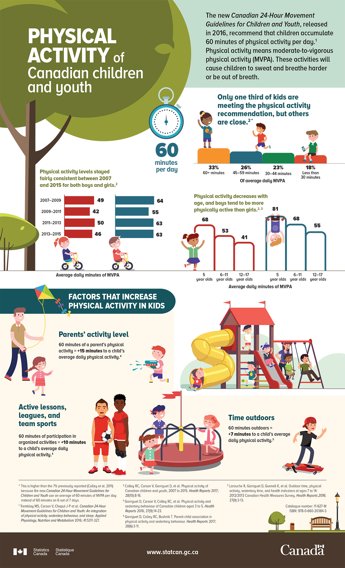
This is an infographic titled, Physical Activity of Canadian Children and Youth created by Statistic Canada. The title of the infographic sits on top of a graphic of a tree.
To the right of the titled there is a light green box. Within the box there is text the reads, “The new Canadian 24-Hour Movement Guidelines for Children and Youth, released in 2016, recommend that children accumulate 60 minutes of physical activity per day. Physical activity means moderate-to-vigorous physical activity (MVPA). These activities will cause children to sweat and breathe harder or be out of breath.
Back to the left side of the infographic, right below the tree graphic, there are two horizontal bar graphs. The title for both graphs is “Physical activity levels stayed fairly consistent between 2007 and 2015 for both boys and girls. Each graph has four vertical bars. The graph that shows data for girls is red. There is a picture of a girl on a bike under the graph. The graph that shows data for boys is blue. There is a picture of a boy on a bike under the graph.
Here is a breakdown of the data in minutes for girls:
From 2007-2009 the average daily minutes of moderate-to-vigorous physical activity (MVPA) was 49 minutes. From 2009-2011 it was 42 minutes. From 2011-2013 it was 50 minutes. From 2013-2015 it was 46 minutes.
Here is a breakdown of the data in minutes for boys:
From 2007-2009 the average daily minutes of moderate-to-vigorous physical activity (MVPA) was 64 minutes. From 2009-2011 it was 55 minutes. From 2011-2013 it was 63 minutes. From 2013-2015 it was 63 minutes.
To the right of these graphs, there are other three data visualizations.
The first of the two is a vertical bar graph with four bars. Above the graph there is text that reads, “Only one third of kids are meeting the physical activity recommendation, but others are close. To the left of the bar there is a picture of a clock with the text that reads, “60 minutes per day.”
Here is a breakdown of the data. The x-axis is labelled “Of average daily MVPA.” The data is represented in minutes. 33% of kids are getting 60+ minutes of moderate-to-vigorous physical activity (MVPA); 26% are getting 45-59 minutes of MVPA; 23% are getting 30-44 minutes of MVPA; and 18% are getting less than 30 minutes of MVPA.
The second and third bar graphs are side by side and show the average daily minutes of MVPA for children aged 5-17 years old. The text above the graphs reads, “Physical activity decreases with age, and boys tend to be more physically active than girls.” The bars are styled to resembled monkey bars. The graph on the left is red and shows data for girls aged 5-17 years old. The graph on the right is blue and shows data for boys aged 5-17 years old.
Here is the breakdown for the data for girls:
5 year-old girls averaged 68 daily minutes of moderate-to-vigorous physical activity (MVPA); 6-11 year old girls averaged 53 minutes; 12-17 year-old girls averaged 41 minutes.
Here is a breakdown for the data for boys:
5 year-old boys averaged 81 daily minutes of moderate-to-vigorous physical activity (MVPA); 6-11 year old boy averaged 68 minutes; 12-17 year-old boys averaged 55 minutes.
In the next section below, there is a heading that reads, “Factors that increase physical activity in kids.” There are three factors presented and they are accompanied by various visuals.
The first factor is, “Parents’ activity level.” The text below reads, “60 minutes of a parent’s physical activity = +15 minutes to a child’s average daily physical activity. This text is accompanied by a picture of a grown-up, presumably a father, with a kite and a boy and a girl.
The second factor is, “Active lessons, leagues, and team sports.” The text below reads, “60 minutes of participation in organized activities = +10 minutes to a child’s average daily physical activity. This text is accompanied by a picture of two characters in sports uniforms. A boy with a soccer ball, and a girl with with knee pads.
The third factor is, “Time outdoors.” The text below reads, “60 minutes outdoors = +7 minutes to a child’s average daily physical activity. The text is accompanied by three pictures: an outdoor jungle gym, a merry-go-round, and a boy on a skateboard.
Consolidation
Design your own infographic
Student Success
Think-Pair-Share
Create a plan for an infographic.

Here are your steps:
Step 1: Select a topic of interest. What questions do you have about this topic that you could collect data for? For example, if you select environmental sustainability as your topic, you could explore,
- What are the best ways to conserve water?
- What are steps we can take to reduce our carbon footprint?
- How can we make more energy-efficient choices in our daily lives?
Step 2: Create a list of resources that you will use to collect information and data. Be sure to collect data that you can represent in a stacked bar graph and a relative-frequency table.
Step 3: Decide who this infographic is for. It’s important to consider who you want to share this information and data with. Who is your target audience? Keep in mind that you are planning out a story about data for your target audience.
Step 4: What data visualizations will you use? You can use a variety of representations including charts, plots, graphs, and some text. Again, keep in mind that your infographic has to include a stacked bar graph and a relative-frequency table. You can create your graphs using a method of your choice.
Note to teachers: See your teacher guide for collaboration tools, ideas and suggestions.
Think about your learning

Examine your infographic design. Is your message coming through? How do you know? Use the following questions to reflect on your learning and your infographic design. Record your responses using a method of your choice.
- What message does your infographic or data representation share?
- What data visualization and/or descriptions did you include to help get your message across?
- Explain why an infographic is an effective way to share data.
- How could you use infographics in real life?
If possible, share your infographic design with a partner or a family member.
Reflection
As you read through these descriptions, which sentence best describes how you are feeling about your understanding of this learning activity? Press the button that is beside this sentence.
I feel…
Now, record your ideas using a voice recorder, speech-to-text, or writing tool.
Connect with a TVO Mathify tutor
Think of TVO Mathify as your own personalized math coach, here to support your learning at home. Press ‘TVO Mathify’ to connect with an Ontario Certified Teacher math tutor of your choice. You will need a TVO Mathify login to access this resource.
TVO Mathify (Opens in a new tab)