Minds On
Data in the different graphs
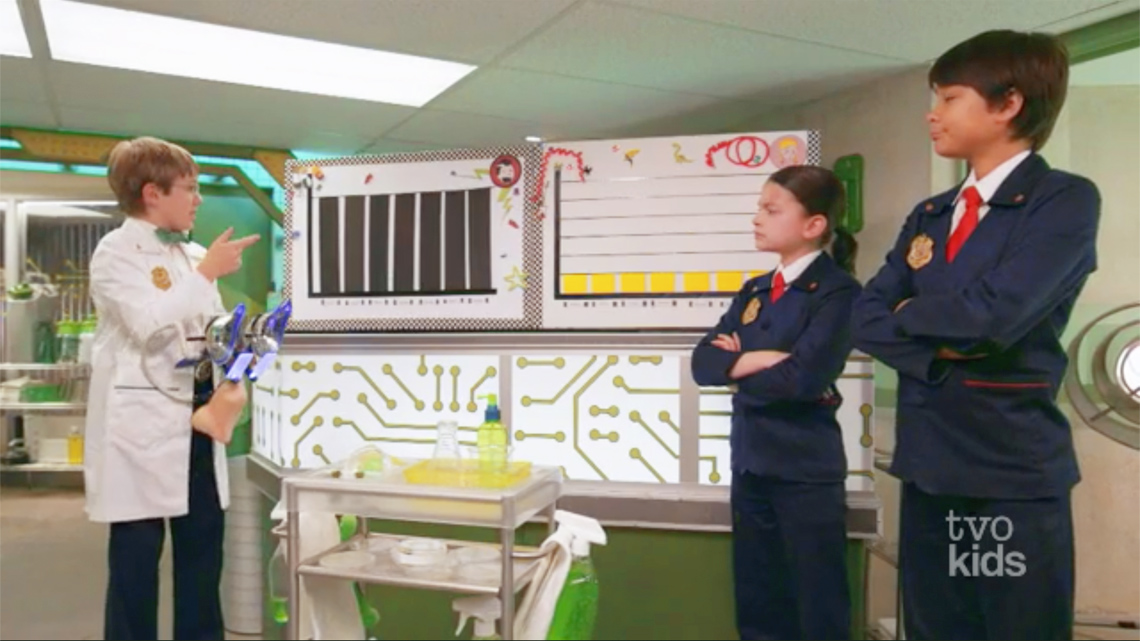
Explore the following video of Odd Squad where Polly mysteriously quits her lemonade stand after Odd Todd opens his own.
 Description
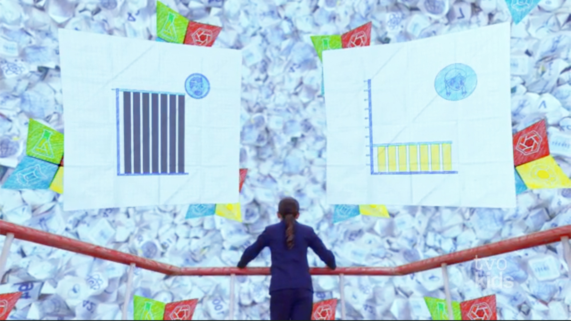
There are two vertical bar graphs that were created by Odd Todd. They are the same size and show how many people drank lemonade each day in one week. Both graphs have the days of the week labelled from Monday to Sunday. One graph (the graph on the left) shows how many people drank Odd Todd’s lemonade in one week. The other graph (the graph on the right) shows how many people drank Polly’s lemonade in the same week. Todd’s bar graph has 7 very tall and equally tall bars as the height of the y-axis. Polly’s bar graph has 0-100 numbers on the Y-axis and 7 equal bars on the X-axis up to the number 30, showing that 30 people drank Polly's lemonade.
Examine the two graphs and the data that is represented.
- Why do you think the data in these graphs is or is not represented fairly?
- Is it possible that Odd Todd has done something to make it seem like his lemonade is more popular?
- How could you adjust the graphs to make them clearer?
Throughout this learning activity, you can record your thoughts digitally, orally, or in print.
Misleading graphs
- You probably noticed that the data in Odd Todd’s graphs were not represented fairly.
- Sometimes graphs misrepresent data, which can influence the conclusions that we make. Misleading graphs misrepresent data on purpose, but also accidentally. Either way, it is for this reason that it is important to always critically interpret the data that we are presented with.
Here are a few ways to make sure that data is represented fairly.
Example #1
These are two vertical bar graphs that show the same survey results about favourite seasons. Both graphs are titled "Favourite Seasons." The x-axis is labelled, “Seasons” and shows the names of the different seasons, Spring, Summer, Fall, and Winter. The y-axis is labelled, “Number of students.”
 Description
Two bar graphs titled 'Favourite seasons' representing the same data. Both graphs have an x-axis labeled 'Seasons' with 4 bars labeled Spring, Summer, Fall, and Winter. Both graphs have a y-axis labeled 'Number of learners', but graph 1 has a scale starting at 50 that goes up by fives to 65, while graph 2 has a scale starting at 0 that goes up by twenties to 60.
Should the scale of a graph start at 0?
In general, most graphs start at 0. Graphs that start at a number other than 0 tend to be misleading. For example, the two vertical bar graphs above show the results of a survey about favourite seasons. Both graphs show the same data, but each graph tells a different story. The scale in the first graph starts at 50, which makes the fall season appear more popular than the other seasons. Meanwhile, the fall season only received eight more votes than the spring and summer and ten more votes than the winter.
Example #2
Check out the following tabs to explore two diverse two-line graphs that use the same data.
Is the scale too big or too small?
It’s important to keep in mind that the scale of a graph can affect its appearance. Picking a scale that’s too big or too small can make changes in data seem exaggerated or less important than they really are.
Take for example the two diverse line graphs you explored in the previous tabs. The graphs both use the same data. However, by making the scales different, it makes the increase in food drive participants over time seem small or insignificant over the five year period. This is because the scale for the first graph is too big. The greatest number in the data set is 300. For this reason, the scale on the y-axis should start at 0 and go up to 350 at the most.
Example #3
Explore the following tabs to examine two different two-line graphs. The first graph is just for three months from January to March 2021, while the second graph shows the data for an extended period of time. The second graph shows the data of 12 months starting May 2020 till April 2021.
Is all the data there?
Misleading graphs leave out or only include certain parts of a data set. This is similar to leaving out the key parts of a story. For example, the first graph above only shows a few months out of the year and a downward trend. The second graph uses a wider data range of 12 months from May 2020 to April 2021. With the second graph, it’s easier to get the bigger picture of the data.
Bad lemonade video – part 2
Let’s return to the Odd Squad episode in the Minds On.
Later in the episode, the Mathroom helped in examining Todd’s two graphs more closely. Neither of the graphs has numbers on the y-axes.
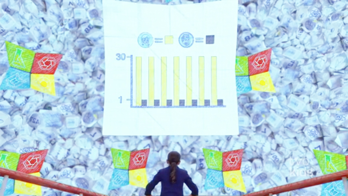
Without numbers on the y-axis, we do not know how many people each bar stands for. Once Mathroom puts numbers along the y-axis, the following data is shown.
- one person drank Todd’s lemonade each day
- 30 people drank Polly’s lemonade each day
Without values along the y-axis Todd could make it seem like more people were drinking his lemonade.
This is a great example of how much the scale of a graph can affect its appearance. Odd Todd’s vertical scale is 0-1 which makes the bars in the graph for his lemonade stand data appear longer than Polly’s (whose scale is 0-100).
The Mathroom then generated a graph to show Todd’s and Polly’s numbers side by side that uses the same numbers (scale) for both. This graph allows us to compare Todd’s and Polly’s numbers in the same graph .
Time for tasks
Task 1: Compare graphs
Student A and Student B both created vertical bar graphs to represent the number of tickets sold for each date of their community’s Spring Performance.
Student B feels that the ticket sales for the show on April 29th were much better than any other date.
Student A feels that while they did sell the most tickets on April 29th, the ticket sales on April 29th are similar to the other dates.
Use the two graphs to respond to the following questions. Record your responses using a method of your choice.
- Why does Student A feel this way?
- Why does Student B feel this way?
- Are there any mathematical calculations you could make to support your ideas?
Task 2: Examine graphs
Student Success
Think-Pair-Share
Examine the bar graph below. What is it that makes this graph misleading or deceptive?
Record your thinking using a method of your choice.
| Favourite Book Genres (Source: School XYZ junior students) | |
|---|---|
|
Book Genre |
Number of students |
|
Realistic fiction |
72 |
|
Mystery |
61 |
|
Science fiction |
64 |
|
Non-fiction |
66 |
Note to teachers: See your teacher guide for collaboration tools, ideas and suggestions.
As another option, recreate the bar graph with a y-axis (vertical axis) starting at zero. You can create a bar graph on paper or digitally.
Compare the two bar graphs and describe what makes the original graph misleading or deceptive. Record your thinking using a method of your choice.
Create a misleading graph
Consider the following data from a catering order:
- 90 people chose two slices of pizza
- 80 people chose chicken tenders
- 60 people chose vegetable sticks and crackers with hummus
Create a misleading bar graph that makes it seem like far more people ordered two slices of pizza over the other options.
You can create your graph on paper or digitally. You can also record a detailed description that explains how the data is misleading or deceptive.

Describe what is misleading or deceptive about your graph. You can record your ideas using a method of your choice.
Questions to think about:
Use the following questions to reflect on your learning. You can record your ideas using a method of your choice.
- How might a graph be misleading or deceptive?
- How might a misleading graph change our understanding of a set of data?
- Why are misleading graphs used?
- What sort of things do you need to pay attention to when analyzing a graph?
- How do you make sure that data is represented fairly and accurately in the graph that you create?
Reflection
As you read through these descriptions, which sentence best describes how you are feeling about your understanding of this learning activity? Press the button that is beside this sentence.
I feel…
Now, record your ideas using a voice recorder, speech-to-text, or writing tool.
Connect with a TVO Mathify tutor
Think of TVO Mathify as your own personalized math coach, here to support your learning at home. Press ‘TVO Mathify’ to connect with an Ontario Certified Teacher math tutor of your choice. You will need a TVO Mathify login to access this resource.
TVO Mathify (Opens in a new tab)