Minds On
Methods of organizing data

Explore the following scenario.
Length of stay at park
The Parks and Recreation Department conducted an exit survey to find out how long visitors stay at their park. They used a tally chart to track how long visitors were in the park:
|
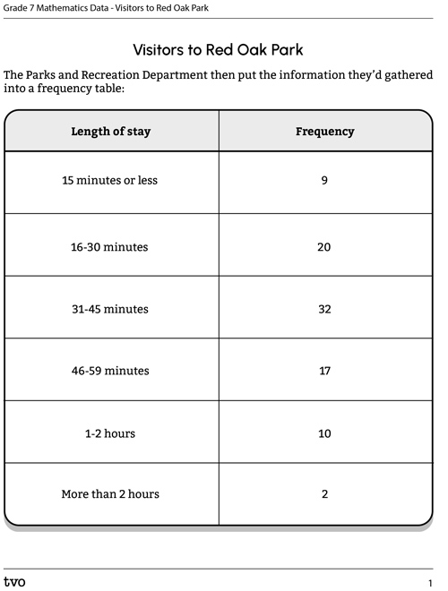
Visitors to Red Oak Park
Approximately how long did you enjoy our park today? |
|
| 15 minutes or less | |
| 16-30 minutes | |
| 31-45 minutes | |
| 46-59 minutes | |
| 1-2 hours | |
| More than 2 hours | |
The Parks and Recreation Department then put the information they’d gathered into a frequency table:
| Length of stay | Frequency |
|---|---|
| 15 minutes or less | 9 |
| 16-30 minutes | 20 |
| 31-45 minutes | 32 |
| 46-59 minutes | 17 |
| 1-2 hours | 10 |
| More than 2 hours | 2 |
You’ll be using this data throughout the learning activity. To download the table for future reference, press the following 'Activity' button.
Press the ‘Activity’ button to access the Visitors to Red Oak Park.
Activity (Open PDF in a new tab)Brainstorm
Thinking about the data
Complete Analyzing the Park Data in your notebook or use the following fillable and printable document. Throughout this learning activity, you can record your thoughts and ideas digitally, orally, or in print.
| Analyzing the Park Data |
|---|
|
What type of data is being collected? Explain your thinking. |
|
What was the most common length of time that visitors stayed in the park? |
|
How many visits were longer than an hour? |
|
How many visits were shorter than an hour? |
Press the ‘Activity’ button to access Analyzing the Park Data.
Choosing a graph
What would work better for this data, a histogram or a bar graph?
Press the terms to explore the definitions.
A histogram is type of graph used to display the frequencies of continuous data, grouped into equal intervals. Because the data is continuous, there is no space between the bars.
A bar graph is used to display data in different categories. Because the data is discrete, there are spaces between the bars.
Activity
You know that a histogram displays continuous data, while a bar graph displays discrete data. Think about what this means in terms of whether or not you can change the order of the bars.
For each sentence, select the missing word.
Brainstorm
Graphing the data
Let’s return to the data about the length of time visitors spent in Red Oak Park.
- What type of graph could be used to graph this data? Explain your thinking.
- Explore the intervals that were being used to collect the data. What do you notice about them?
Press ‘Hint’ to reveal some helpful information.
The Parks and Recreation Department considered a histogram. However, that would not work in this case because the categories include minutes and hours, and the intervals are inconsistent.
The department decided to use a bar graph because the data was collected in intervals of time that could be counted. In other words, the data is discrete.
Here is the bar graph that the Parks and Recreation Department produced:

Bar graph titled “Length of Park Visit.” The x-axis is labelled “Time Spent” and indicates the time intervals. The y-axis is labelled “Number of responses,” with a scale that runs from 0 to 40. The bar lengths indicate the following results: 0-15 minutes: 9 visitors, 16-30 minutes: 20 visitors, 31-45 minutes: 32 visitors, 46-59 minutes: 17 visitors, 1-2 hours: 10 visitors, more than 2 hours: 2 visitors.
Action
Continuous or discrete?
Do you remember the difference between continuous and discrete data? For each term, select the corresponding definition.
Activity
Determine whether each of the following data samples is discrete (data that is counted) or continuous (data that is measured).
Select the correct answer, then press ‘Check Answer’ to see how you did.
Organizing continuous data
Scenario: Running data
A group of students decided that they wanted to collect data about how quickly track athletes could run 800 metres. The data was measured in seconds and the results were as follows:
83.2, 91.0, 82.4, 82.6, 65.75, 64.80, 64.2, 72.15, 72.85, 70.80, 90.85, 95.65, 63.95, 75.65, 75.90, 79.40, 80.10, 81.8, 65.20, 78.80
Note: The data in this scenario is continuous. The students are asking the question “How long?” Time is measured, not counted.
The students want to graph the data. A histogram would be a good choice since it displays continuous data and uses intervals. The x-axis is labelled with the intervals, and the y-axis indicates the frequency of the categories. However, in order to graph continuous data on a histogram, you must have equal intervals.
Creating equal intervals
Press these steps to learn how to create equal intervals for the running data.
Sort the data into equal intervals or groups. The data collected can only fall within one interval.
Example: Consider the data in the Minds On section (length of stay in Red Oak Park). The time intervals were not equal. Some were intervals of 15 minutes, while others were 60 minutes. To graph the data, we would need to create new intervals, such as the following: 0-15 minutes, 16-31 minutes, 32-47 minutes, 48-63 minutes, 64-79 minutes, and more than 80 minutes.
Use the intervals you created in Step 2 to create a frequency table or tally chart of the running data.
Complete Frequency Table: Running Data in your notebook or using the following fillable and printable document.
| Interval | Number of athletes | Frequency |
|---|---|---|
| Total | 20 |
Press the ‘Activity’ button to access Frequency Table: Running Data.
Press ‘Answer’ to reveal the answer.
| Frequency Table: Running Data | ||
|---|---|---|
| Interval | Number of athletes | Frequency |
| 60-69.9 | 5 | |
| 70-79.9 | 7 | |
| 80-89.9 | 5 | |
| 90-99.9 | 3 | |
| Total | 20 | |
Create a graph or equivalent
Create a histogram to graph the data. You can also use your notebook, the following fillable and printable document or any method of your choice.
Press ‘Hint’ to reveal the histogram example.
Consider the use of a histogram. A histogram uses continuous data, and intervals. The x-axis is labelled with the intervals, and the y-axis is the frequency of the categories. Order matters in a histogram. You would never rearrange the bars of a histogram because the intervals are continuous, one after the other. You could rearrange the bars of a bar graph and it would still make sense because each bar is counted independently.
 Description
A histogram titled "Bricks per building." The x-axis is labeled "Number of bricks" and starts at 0 with intervals of 20 up to 89. The y-axis is labeled "Number of buildings" and starts at 0, going up by ones to 5. The height of the bars indicate the following data: 0 to 19 bricks = 5, 20 to 39 bricks = 1, 40 to 59 bricks = 5, 60 to 79 bricks = 2, 80 to 89 bricks = 2.
If you would like, you can use TVO Mathify to plan out your histogram. You can also use your notebook or the following fillable and printable document.
Press the ‘TVO Mathify' button to access this resource and the ‘Activity’ button for your note-taking document. You will need a TVO Mathify login to access this resource.
TVO Mathify (Opens in new window) Activity (Open PDF in a new window)Press ‘Answer’ to reveal the answer.

There is a histogram titled How long does it take to run 800m? The x-axis is labelled Running time (seconds) with 4 intervals: 60-69.9, 70-79.9, 80-89.9 and 90-99.9. The y-axis is labelling Number of athletes and goes up by ones from 0-8. 60-69.9 has a bar that goes up to 5, 70-79.9 has a bar that goes up to 7, 80-89.9 has a bar that goes up to 5, 90-99.9 has a bar that goes up to 3. There is no space between the bars.
Brainstorm
Analyze the data
Analyze the data in your histogram.
- List three statements about the results that you can justify with the data you collected.
- What was the most common length of time it took an athlete to run 800 m?
Determining percentages
An alternative way to represent data is to use percentages.
What percentage of the athletes were in each category/interval?
Converting a number into a percentage
To convert a number into a percentage, divide the total number of athletes in an interval by the total number of pieces of data and then multiply by 100%.
For example, let’s say the interval “60-68 seconds” was used, and there were five athletes in that interval. To convert to a percentage:
25% of the total athletes ran 800 m within this interval of time.
You will now practise determining percentages, using your own intervals and the number of athletes in each.
Complete the Running Data: Calculating Percentages in your notebook or use the following fillable and printable document. If you prefer, use another method to record your ideas.
| Interval | Number of athletes | Percentage of total athletes |
|---|---|---|
|
Total |
20 |
100% |
Press the ‘Activity’ button to access Running Data: Calculating Percentages.
Press ‘Answer’ to reveal the answer.
| Running Data: Calculating Percentages | ||
|---|---|---|
| Interval | Number of athletes | Percentage of total athletes |
| 60-69.9 | 5 | 25 |
| 70-79.9 | 7 | 35 |
| 80-89.9 | 4 | 25 |
| 90-99.9 | 3 | 15 |
|
Total |
20 |
100% |
Consolidation
Analyzing data
Explore the following histogram.
Test Your Skills!
Test your skills
Referring to the histogram you explored in the previous section, answer these questions. Record your ideas using a method of your choice.
- What type of data is this, continuous or discrete? How do you know?
- What are the intervals used?
- What is the most common height of the saplings?
- How many saplings are taller than 170 cm?
- How many saplings are smaller than 170 cm?
- What percent of saplings are between 125-140 cm tall?
- What percent of saplings are between 185-200 cm tall?
Press ‘Hint’ if you need help calculating the percentages.
To convert a number into a percentage, divide the total number of saplings in an interval by the total number of pieces of data and then multiply by 100%.
For example:
Think about your learning
Reflect on what you’ve learned about asking questions, collecting, and organizing data. Record your ideas using a method of your choice.
- Describe how frequency tables and percentages help us draw conclusions from data.
- What is the purpose of using intervals to collect and record data?
- How are continuous and discrete data different?
Reflection
As you read the following descriptions, select the one that best describes your current understanding of the learning in this activity. Press the corresponding button once you have made your choice.
I feel…
Now, expand on your ideas by recording your thoughts using a voice recorder, text-to-speech, or writing tool.
When you review your notes on this learning activity later, reflect on whether you would select a different description based on your further review of the material in this learning activity.
Connect with a TVO Mathify tutor
Think of TVO Mathify as your own personalized math coach, here to support your learning at home. Press ‘TVO Mathify’ to connect with an Ontario Certified Teacher math tutor of your choice. You will need a TVO Mathify login to access this resource.
TVO Mathify (Opens in new window)