Minds On
Notice and wonder
Examine the following scatter plot.
This scatter plot shows the relationship between the age and shoe size of six children. Use the following questions to guide your exploration.
Throughout this learning activity, you can record your ideas digitally, orally, or in print.
An outlier is a data point or data value that lies outside of the of the overall pattern of data. Sometimes a data set has outliers because something has gone wrong in the data collection or measurement. For this reason, outliers should be examined further. The researcher needs to determine if the outlier is an unexpected piece of data, a measurement error, or data that was incorrectly entered. If none of these are uncovered, then re-sampling may be needed.
Action
Task 1: What’s the pattern?
When we consider data sets, we may analyze the overall pattern and examine whether there are any changes or deviations from that pattern.
The overall pattern of a scatter plot can be described by the direction and strength of the relationship.
An outlier is a value that falls outside the overall pattern in a set of data.
Let’s explore a graph with two variables.
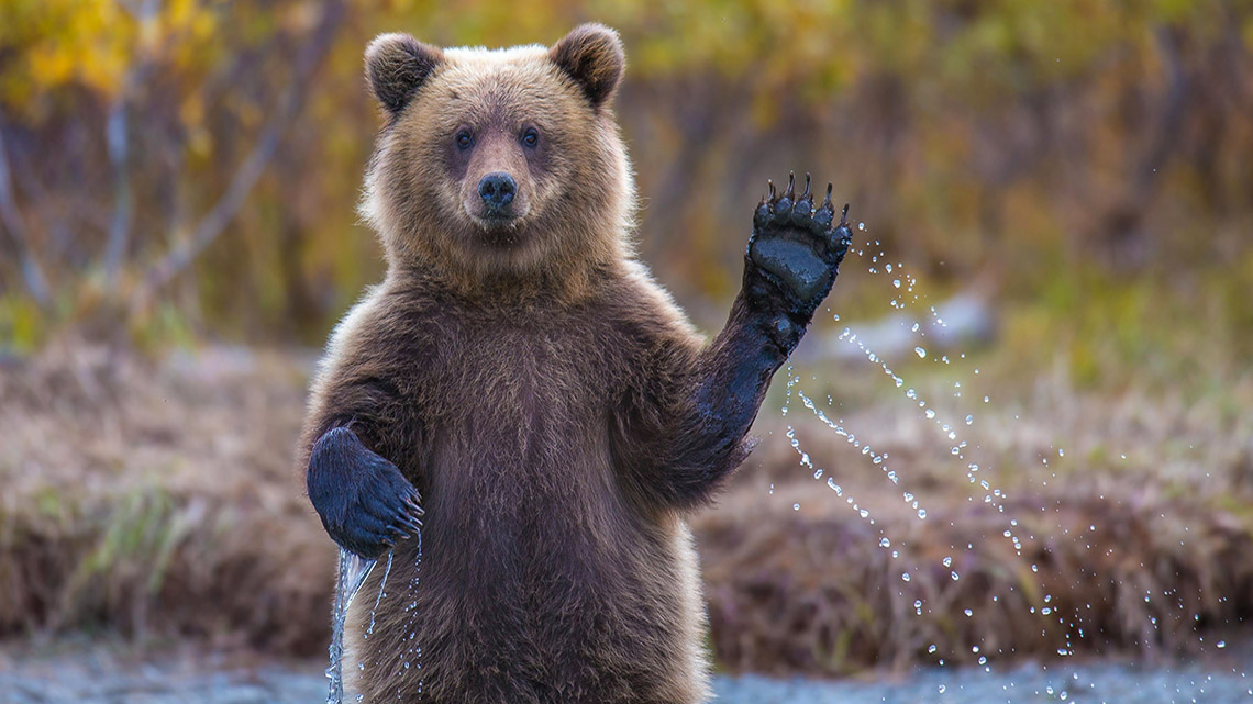
The heights and weights of bears
The following set of data shows the height h (in cm), and weight w (in kg), of nine different bears. Start by examining the table of values. Then, examine the scatter plot with the same data.
Describe any patterns or trends you notice.
Include math terms such as, “strong, “weak,” “none,” “positive,” or “negative,” to describe the direction and strength of the relationship between height and weight.
Are there any outliers in the set of data?
You can record your thinking using a method of your choice.
|
Height (in cm) |
Weight (in kg) |
|---|---|
| 110 | 35 |
| 114 | 38 |
| 120 | 44 |
| 125 | 49 |
| 132 | 56 |
| 150 | 72 |
| 152 | 74 |
| 160 | 80 |
| 165 | 85 |
The following scatter plot records the heights and weights of the nine bears.
Data relationships
Scatter plots are often used to record measurements of two or more variables.
We can use the scatter plot to determine if two variables have a relationship. If there is a relationship between them, we can also determine the strength of the relationship.
It’s important to keep in mind that it is possible for two variables to have a strong relationship, weak relationship, or no relationship.
A line of best fit, or a curve of best fit, can be drawn through the majority of the data points and used to make predictions where there is a strong relationship between the two variables.
Let’s explore the different types of relationships between variables.
Strong positive relationship
In the example of the height and weight scatter plot we explored, w increases as h increases. The points on the scatter plot lie on a relatively straight line. We identify this as a strong positive relationship that exists between the variables h and w, as the line goes up from left to right on the graph. As h increases, w increases.
Strong negative relationship
Consider the following scatter plot where the y value decreases as the x value increases. We can note that a strong negative relationship exists between the variables x and y. The points on the scatter plot lie on a relatively straight line. We can determine that a strong negative relationship exists between the variables x and y.
Weak positive relationship
Now, consider the following scatter plot where the y value increases as the x value increases but the points do not lie on a straight line. We observe a trend, but there is a weak positive relationship exists between the variables x and y. The data points do not lie on a straight line. We indicate that a weak positive relationship exists between the variables x and y.
Weak negative relationship
Consider the following scatter plot data where the y value decreases as the x value increases and the points do not lie on a straight line. We observe a trend, but we indicate that a weak negative relationship exists between the variables x and y.
On this graph, y decreases as x increases, and the points do not lie on a straight line. We identify that a weak negative relationship exists between the variables x and y.
No relationship
Consider the following scatter plot data where the x value increases, there is no apparent relationship to the corresponding y value. In such a case, no relationship exists between the variables x and y.
As identified in the scatter plot, as x increases, there is no apparent relationship to the corresponding y value. It would not be appropriate to add a trend line, or line of best fit in this situation. In such a case, no relationship exists between the variables x and y.
Outliers
Consider the following scatter plot data where there are two points outside of the positive relationship. These are outliers in the set of data values. The majority of the data follows a positive relationship, with two data points that do not follow the pattern.
If a data value does not fit the overall pattern or trend of a set of data, then it is considered an outlier. There are two outliers in the set of data values. This is also visually represented in the scatter plot. There are two points of data that sit far away from the rest of the data points.
As mentioned in the Minds On section, if a data set has outliers, something may have gone wrong in the data collection or measurement. Outliers require further investigation.
Task 2: Matching two-variable data to relationships
In the following multiple choice activity, choose the type of relationship for the two-variable data sets. Options include:
- positive relationship
- negative relationship
- no relationship
Brainstorm
Strong or weak relationship?
As we have discovered, some relationships can be “strong” or “weak.” Think which math term would best describe the relationships in the data sets you explored previously.
Task 3: Fill in the blank activity
Complete the document Relationship using the following fillable and printable document or using a method of your choice. Fill in the blanks with scenarios that you believe would have a strong, weak, positive, or negative relationship and complete the other two sentences.
Consolidation
Graph and analyze
Examine the following table of values.
Then, use the data to create a scatter plot. You can create your graph on paper, or use TVO Mathify to discuss the data and overall pattern or trend.
A meteorologist collected data on temperature and relative humidity each hour for 12 hours.
| Time | Temperature (°C) | Relative humidity (%) |
|---|---|---|
| 1:00 pm | 30 | 51 |
| 2:00 pm | 31 | 48 |
| 3:00 pm | 32 | 46 |
| 4:00 pm | 31 | 46 |
| 5:00 pm | 28 | 62 |
| 6:00 pm | 30 | 49 |
| 7:00 pm | 30 | 47 |
| 8:00 pm | 29 | 52 |
| 9:00 pm | 27 | 58 |
| 10:00 pm | 24 | 69 |
| 11:00 pm | 23 | 73 |
| 12:00 am | 21 | 82 |
Press the ‘TVO Mathify' button to access this interactive whiteboard and the ‘Activity’ button for your note-taking document. You will need a TVO Mathify login to access this resource.
TVO Mathify (Opens in new window) Activity (Open PDF in a new window)Reflect and connect
Once you have created your graph, use the following questions to reflect on the data.
You can record your responses using a method of your choice.
- Does there appear to be a relationship between the variables? If so, describe it using math terms like “strong,” “weak,” “positive,” “negative,” or “none.” Explain your thinking.
- Are there any outliers in this data set? How do you know? If yes, why might this be?
Reflection
As you read the following descriptions, select the one that best describes your current understanding of the learning in this activity. Press the corresponding button once you have made your choice.
I feel…
Now, expand on your ideas by recording your thoughts using a voice recorder, speech-to-text, or writing tool.
When you review your notes on this learning activity later, reflect on whether you would select a different description based on your further review of the material in this learning activity.
Connect with a TVO Mathify tutor
Think of TVO Mathify as your own personalized math coach, here to support your learning at home. Press ‘TVO Mathify’ to connect with an Ontario Certified Teacher math tutor of your choice. You will need a TVO Mathify login to access this resource.
TVO Mathify (Opens in new window)