Minds On
Action
Types of relationships
Let’s revisit the scatter plots of the Minds On section.
A scatter plot is a graph that is made by plotting coordinate pairs.
A scatter plot is designed to display if one set of data has a relationship with another set of data. It also displays if one set of data can be used to make predictions about another set of data.
For example, a graph might display the relationship between shoe size and height, or the relationship between circumference and diameter.

A relationship between data points can be described as “positive,” “negative,” “strong,” or “weak.” A scatterplot can also display that there is no relationship between two variables at all. This is when you would use “none” to describe the relationship.
No relationship
When data points are in a cluster, this indicates that there is no relationship between the variables. No relationship exists.

Strong relationship
When data points are close together, this indicates that there is a strong relationship between the two variables.


Weak Relationship
When a scatter plot records data points that are more spread out (more than those displaying a strong relationship), this indicates a weak relationship.


Task 1: Analyzing a table of values and scatter plot

A group of Grade 8 students want to convince their principal that an ice cream truck should be part of their end of school year fundraiser.
They have decided to track the relationship between temperature and ice cream sales in the spring for 14 days to make a convincing argument.
Examine the following table of values and scatter plot.
Create a line of best fit to display a strong positive relationship through the points that are already plotted. This will help support the students’ argument.
Using the line of best fit, identify where the three missing data points could be plotted and plot them on the scatter plot.
Then, add the missing data points in the table of values.
Throughout this learning activity, record your ideas digitally, orally, or in print.
| Temperatures vs. Ice Cream Sales | |
|---|---|
| Temperature (°C) | Ice Cream Sales ($) |
| 11 | 300 |
| 9 | 200 |
| 14 | 300 |
| 17.8 | 445 |
| 19 | 475 |
| 15.8 | 390 |
| 15 | 400 |
| 17 | 575 |
| 18.2 | 410 |
| 17 | 400 |
| 21 | 525 |

Scatter plot titled “Ice Cream Sales vs. Temperature.” The x-axis is labelled “Temperature (in degrees Celsius).” The y-axis is labelled: Ice Cream Sales (in dollars).” The x-axis starts at 0 and goes up by 2 from 8 to 22. The scale on the y-axis starts at 0 and goes up by 200 to 600. The data points are plotted closely together and form a strong positive correlation."
Press ‘Information’ to check your understanding of the table of values and scatter plot.
This table of values has two columns. The first column is titled “Temperature (°C)” and the second column is titled “Ice Cream Sales (in dollars).” There are 3 coordinate pairs missing. x and y coordinate are listed in the table of values as follows: the first coordinate pair is missing followed by (11, 300); (9, 200); (14, 300); (17.8, 445); (19, 475); (15.8, 390) following by a missing coordinate pair and then (15, 400); (17, 575) followed by a missing coordinate pair and then (18.2, 410); (17, 400); (21, 525).
The scatter plot visually represents the data from the table of values. The scatter plot is titled “Ice Cream Sales vs. Temperature.” The x-axis is labelled “Temperature (in degrees Celsius)” and the y-axis is labelled “Ice Cream Sales (in dollars).” The x-axis starts at 0 and goes up by 10 to 20. The scale on the y-axis starts at 0 and goes up by 200 to 600. The data points are plotted closely together and form a strong positive relationship.
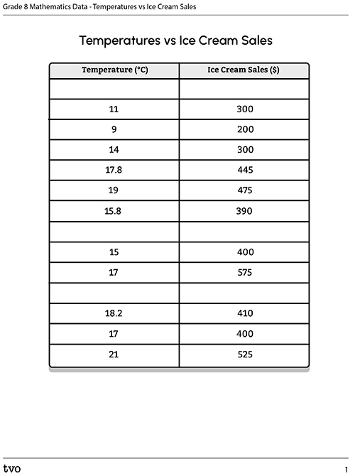
Complete the table Temperatures vs Ice Cream Sales using the following fillable organizer, using TVO Mathify, or another method of your choice.
| Temperature (°C) | Ice Cream Sales ($) |
|---|---|
| 11 | 300 |
| 9 | 200 |
| 14 | 300 |
| 17.8 | 445 |
| 19 | 475 |
| 15.8 | 390 |
| 15 | 400 |
| 17 | 575 |
| 18.2 | 410 |
| 17 | 400 |
| 21 | 525 |
Press the Activity button to access the Temperatures vs Ice Cream Sales.
Activity (Open PDF in a new tab)If you would like, you can complete the next activity using TVO Mathify, a notebook or the method of your choice.
Press the ‘TVO Mathify' button to access this interactive whiteboard and the ‘Activity’ button for your note-taking document. You will need a TVO Mathify login to access this resource.
TVO Mathify (Opens in new window) Activity (Open PDF in a new window)Draw the line of best fit to show a strong positive relationship. Then, add the missing data points on the scatter plot.
Reflect on the data
Use the following questions to reflect on your scatter plot.
- What do you notice about the data? Describe how the points appear on the graph.
- What points did you add to the scatter plot? Explain your reasoning.
- How do you know that there is a strong positive relationship between ice cream sales and temperature?
Identify the outlier and create a possible scenario for the outlier in the data set.
Press ‘Hint’ to reveal the sample scatter plot reflections.
- The data points are increasing along the x-axis and the y-axis steadily. As the temperature gets higher, the sales increase.
- I added these three points to my graph and table of values: (10, 250), (16, 400), (20, 500). After I drew the line of best fit, I wanted to make sure all the points were as close to that line as possible to be further proof of a strong relationship between temperature and sales.
- I notice there is a strong positive relationship between the temperature and the sales because when I drew the line of best fit, it went through most of the points on the graph, or at least a lot of them.
- The outlier is (17, 575). I think there could have been a lot more people there that day which would mean more sales- maybe it was a weekend. Another possible scenario is that the ice cream truck had a special offer that day which encouraged people to spend more.
Task 2: Creating scenarios
Create your own scenarios to reveal positive, negative, and no relationships.
For example, the strong positive relationships between ice cream sales and temperature, or no relationships between height and hair length.
Use mathematical terms such as “strong,” “weak,” “none,” “positive,” and “negative,” to describe the relationship between two variables.

Consolidation
Strong, weak, none, positive or negative?
Create a scatter plot for one of your scenarios in the Action section.
Be sure to display the data in the plot with a proper source, title, labels, and appropriate scale.
You can create your scatter plot using a method of your choice.
Scatter plot how-to
Press on these steps to learn how to create the scatter plot.
Reflect and connect

Use the following questions to reflect on your learning. You can record your responses using a method of your choice.
- What factors do you consider when selecting a graph to represent a set or sets of data?
- How does a scatter plot help you to make and communicate conclusions about data?
Reflection
As you read the following descriptions, select the one that best describes your current understanding of the learning in this activity. Press the corresponding button once you have made your choice.
I feel…
Now, expand on your ideas by recording your thoughts using a voice recorder, speech-to-text, or writing tool.
When you review your notes on this learning activity later, reflect on whether you would select a different description based on your further review of the material in this learning activity.
Connect with a TVO Mathify tutor
Think of TVO Mathify as your own personalized math coach, here to support your learning at home. Press ‘TVO Mathify’ to connect with an Ontario Certified Teacher math tutor of your choice. You will need a TVO Mathify login to access this resource.
TVO Mathify (Opens in new window)