Minds On
Notice and wonder
Explore the following infographic titled “Let’s Get Moving” from the Ontario Ministry of Education’s Mathematics website.
As you explore the infographic, consider the following questions:
- What messages do you think the author was trying to share?
- Who do you think the infographic was intended for?
- How is the information and data presented?
- How was the information collected?
Throughout this learning activity, you can record your ideas digitally, orally, or in print.
 Description
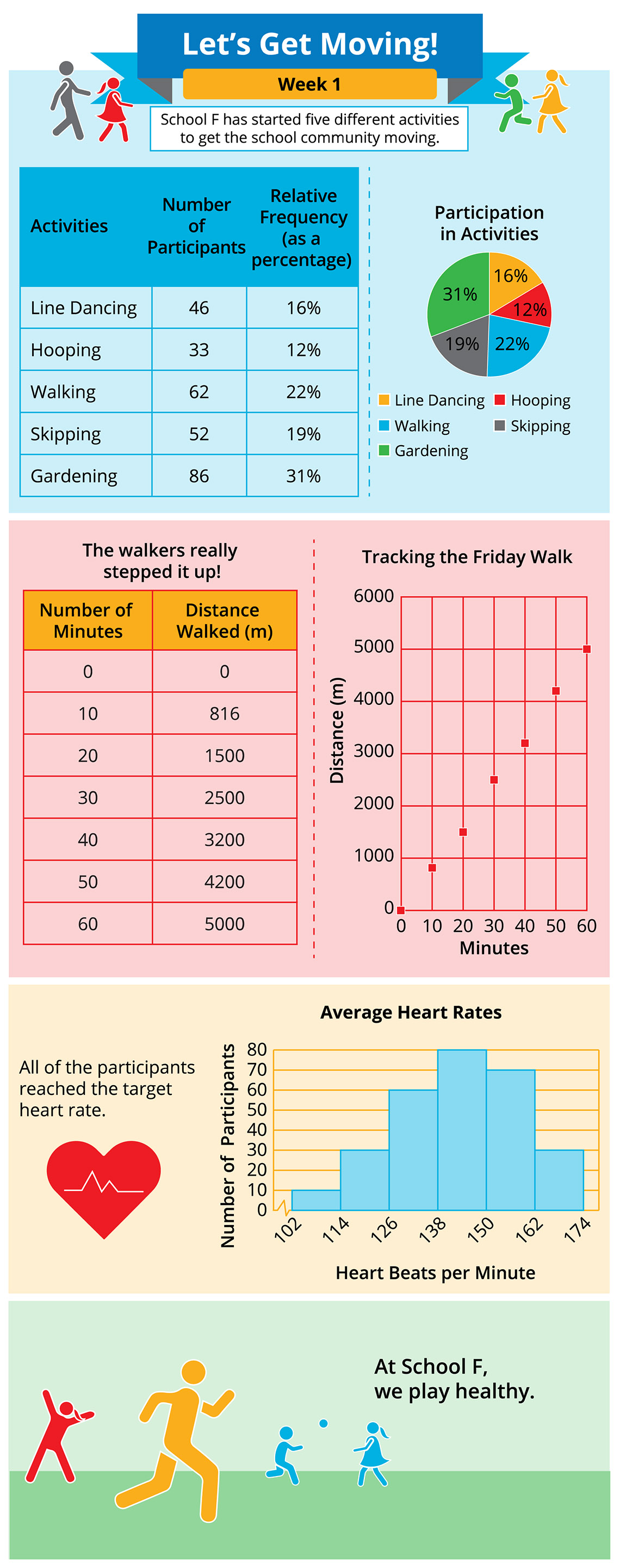
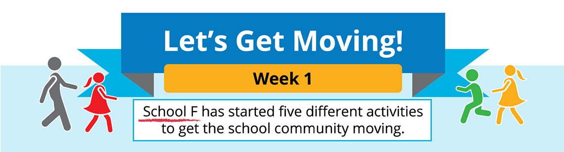
This infographic titled “Let’s Get Moving!” is split into four sections. The subheading just under the title is “Week 1.” A white text box under the subheading reads “School F has started five different activities to get the school community moving.”
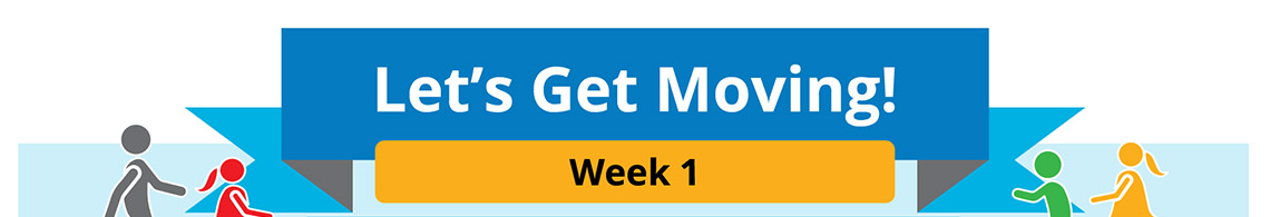
The first section has a table on the left and a circle graph on the right. The table of values lists five activities: line dancing, hooping, walking, skipping, and gardening. The second column lists the number of participants. The third column shows the Relative Frequency (as a percentage). The data are as follows: Line dancing: 46, 16%; Hooping: 33, 12%; Walking: 62, 22%; Skipping, 52, 19%; Gardening: 86, 31%. To the right of the table is a circle graph titled “Participation in activities,” which displays the relative frequency percentages from the table, as follows: Line dancing: 16%; Hooping: 12%; Walking: 22%; Skipping: 19%; Gardening: 31%.
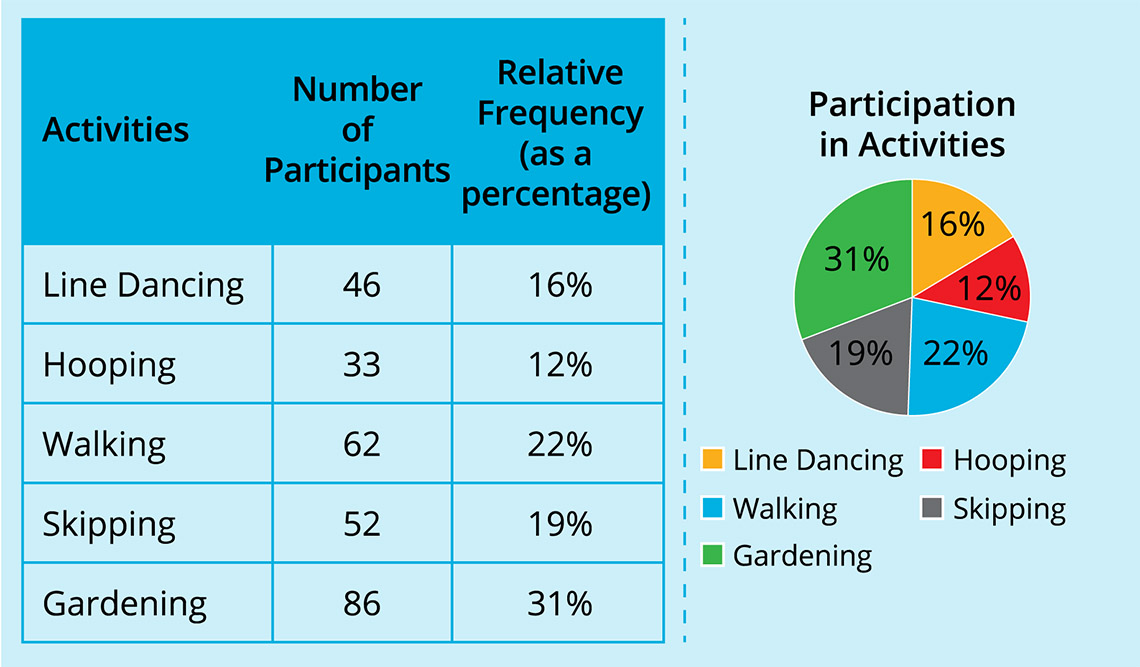
The second section has a table of values titled “The walkers really stepped it up!.” The first column is titled “Number of minutes” and the second column is titled “Distance walked (in metres).” The data (number of minutes and corresponding distance walked (in metres)) from the table is as follows: (0, 0); (10, 816); (20, 1,500); (30, 2,500); (40, 3,200); (50, 4,200); (60, 5,000). A scatter plot titled “Tracking the Friday Walk” displays a positive progression of the data.
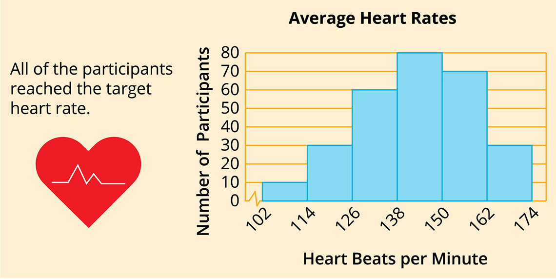
The third section has a heart icon and a text that reads “All of the participants reached the target heart rate.” To the right of the heart icon is a histogram titled “Average Heart Rates.” The x-axis is labelled “Heart beats per minute.” The y-axis is labelled “Number of participants.” The x-axis starts at 102 and goes up by 12s to 174. The scale (y-axis) starts at 0 and goes up by 10s to 80. The data reads, the number of participants with 102-114 heart beats per minute is 10; 114-126 is 30; 126-138 is 60; 138-150 is 80; 150-162 is 70; 162-174 is 30.
The fourth section shows an illustration of characters engaged in different physical activities. The text reads “At School F, we play healthy.”
Action
Elements of an infographic
Let’s analyze the “Let’s Get Moving!” infographic to explore the elements of an infographic.
Purpose
What messages do you think the author is trying to share? Is the author’s purpose to inform, persuade, or entertain?
- Inform: the author’s purpose is to give information about something.
- Persuade: the author’s purpose is to convince the audience of something.
- Entertain: the author’s purpose is to amuse the audience.
 Description
The top part of the infographic “Let’s Get Moving!” shows the title “Let’s Get Moving!.” “Week 1” is written underneath. 4 characters are in colours.
The title often gives us an overview of the topic of the infographic. The content (the text, visuals, and data visualization) is what gives us the information we need to better understand the author’s purpose.
For example, the title “Let’s Get Moving!” and pictures of characters moving both at the top and the bottom of the infographic indicate that the infographic might be about people and physical activity.
The text and data visualizations also help to communicate that the author’s purpose is to give information about the ways a school community is getting active and participating in physical activity.
Target audience
What audience do you think the infographic was intended for?
 Description
The fourth section shows an illustration of four characters engaged in different physical activities. The text reads “At School F, we play healthy.”
To determine who the message is intended for, it helps to consider the following questions:
- Who would be interested in this information?
- What is the meaning behind the message?
- What is the author trying to convey to the reader?
For example, the information and data in the sample infographic focuses on a specific group of people: School F’s school community. For this reason, we could make the conclusion that the intended audience is the School F school community.
The meaning behind the message is that the school community is getting physically active in different ways and people in the school community are participating in various physical activities. This could encourage more people in the school community to participate and/or participate more often.
Data visualizations
What data visualizations has the author used? Why do you think they were chosen?
An infographic is a visual representation of information and data.
The author will use a variety of different graphic elements such as icons, images, illustrations, and font to help explain the topic of an infographic.
Data visualization such as charts, graphs, and plots are also used to provide information about the topic of an infographic. This way, the audience can still understand the message the author is trying to convey without reading any text.
 Description
The table of activities and circle graph show that the number of participants and the relative frequency for the five activities as follows: Line dancing: 16%; Hooping: 12%; Walking: 22%; Skipping: 19%; Gardening: 31%. The five activities are proportionally represented in a circle graph titled “Participation in Activities.”
 Description
The table of value titled “The Walkers really stepped it up” has the first column titled “Number of minutes” and the second column titled “Distance walked (in metres).” The data (number of minutes and corresponding distance walked (in metres)) from the table is as follows: (0, 0); (10, 816); (20, 1500); (30, 2,500); (40, 3,200); (50, 4,200); (60, 5,000). A scatter plot titled “Tracking the Friday Walk” displays the data points in a positive progression.
 Description
The text reads “All of the participants reach the target heart rate” above an illustration of a red heart. The histogram titled “Average Heart Rates” has the x-axis labelled “Heart beats per minute” and the y-axis labelled “Number of participants.” The x-axis starts at 102 and goes up by 12s to 174. The scale (y-axis) starts at 0 and goes up by 10s to 80. The bars show as follows: the number of participants with 102-114 heart beats per minute is 10; 114-126: 30; 126-138: 60; 138-150: 80; 150-162: 70; 162-174: 30.
The infographic uses a few different data visualizations including tables, a circle graph, scatter plot, and histogram.
The table and accompanying circle graph represent the five different activities (line dancing, hooping, walking, skipping, and gardening) they have started to get the school community moving. The circle graph provides a visual representation of the part-to-whole relationship in the data.
The scatter plot is used to show the relationship or correlation between the number of minutes and distance travelled (in metres) in the school’s Friday walk.
The histogram is used to show the average heart rates of participants. This is relevant because the target heart rate is a range of numbers that reflect how fast your heart should be beating during physical activity. Everyone’s target heart rate is different.
Source(s)
How was the information collected?
 Description
The text reads “School F has started five different activities to get the school community moving.”
Credible authors will cite or include the sources of the data so that anyone can check the accuracy of the information that have written and/or displayed.
The source(s) can usually be found at the end of an infographic.
The author of the sample infographic has not cited the source of the data. However, the information and data in the infographic explores the ways School F is getting its school community moving and physically active. We can make the conclusion that the source of the data is School F.
Analyze this!
Examine the following infographic.
Identify its purpose, intended audience, data visualizations used, and data source(s).
 Description
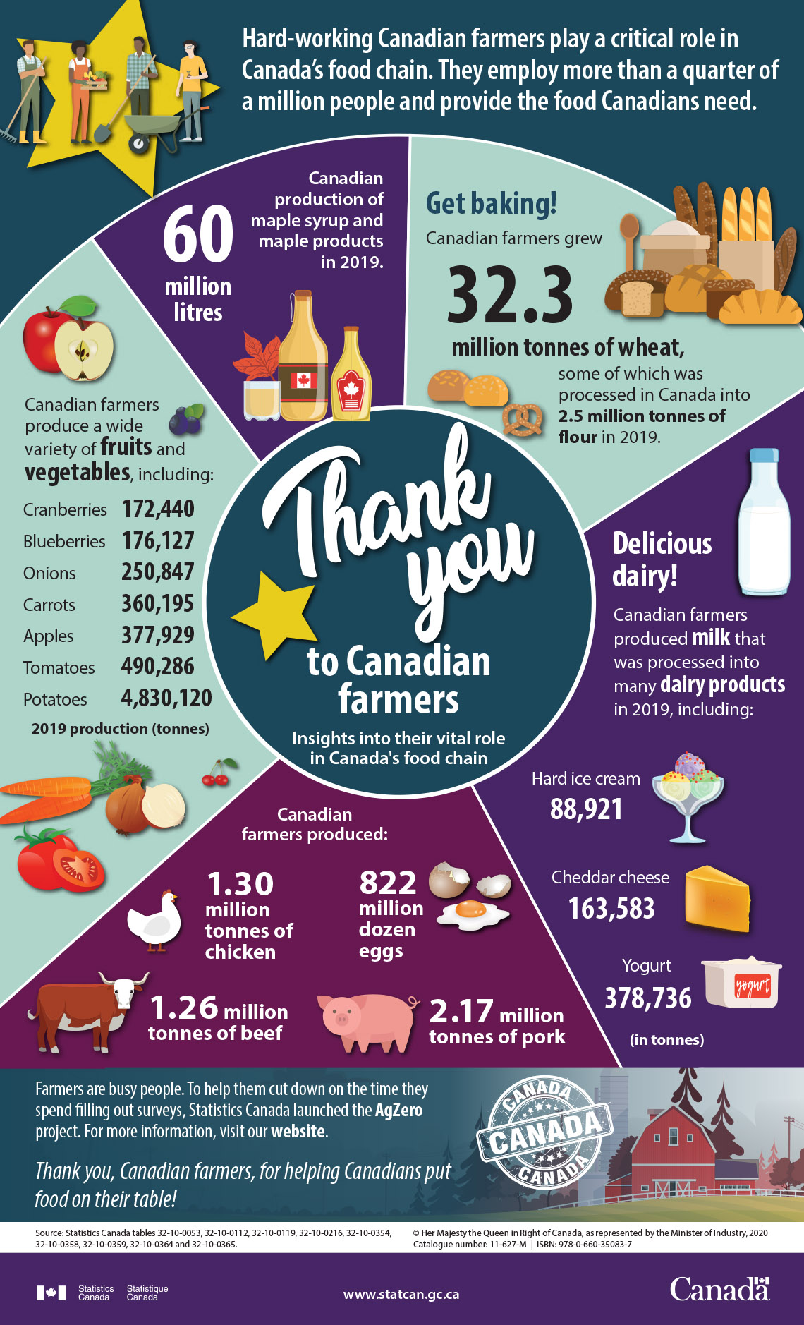
The text at the centre of this infographic reads “Thank you to Canadian farmers: Insights into their vital role in Canada’s food chain.” Above the circle, at the top of the infographic, a text reads “Hard-working Canadian farmers play a critical role in Canada’s food chain. They employ more than a quarter million people, and provide the food Canadians need. To the left of this text there is a start with four different characters that represent farmers.”
In the first section of the circle a text reads “60 million litres, Canadian production of maple syrup and maple products in 2019.” Below the text, there are three illustrated pictures of maple products.
The second section of the circle includes bread illustrations and a text that reads “Get baking! Canadian farmers grew 32.3 million tonnes of wheat, some of which was processed in Canada into 2.5 million tonnes of flour in 2019. Around the text there are illustrated pictures of different types of bread.”
In the third section of the circle, a text reads “Delicious dairy! Canadian farmers produced milk that was processed into many dairy products in 2019.” Statistics in tonnes are given: Hard ice cream, 88,921; Cheddar cheese, 163,583; Yogurt, 378,736.
The fourth section of the circle reads “Canadian farmers produced 822 million dozen eggs, 1.30 million tonnes of chicken, 2.17 million tonnes of pork, and 1.26 million tonnes of beef.”
The fifth section of the circle reads “Canadian farmers produce a wide variety of fruits and vegetables.” The 2019 production in tonnes is as follows: Cranberries: 172,440; Blueberries: 176,127; Onions: 250,847; Carrots: 360,195; Apples: 377,929; Tomatoes: 490,286; Potatoes: 4,830,120.
In the section below the circle a text reads “Farmers are busy people. To help them cut down on the time they spend filling out surveys, Statistics Canada launched the AgZero project. For more information, visit our website. Thank you, Canadian farmers, for helping Canadians put food on their table!”
The last section lists the source of the data. The text reads “Source: Statistics Canada tables 32-10-0053, 32-10-0112, 32-10-0119, 32-10-0216, 32-10-0354, 32-10-0358, 32-10-0359, 32-10-0364 and 32-10-0365.”
You can use the following Infographic Analysis Template or another method of your choice.
Press the Activity button to access the Infographic Analysis Template.
Activity (Open PDF in a new tab)Reflect on the data
Use the following questions to reflect on the infographic. Be sure to explain your thinking. You can record your responses using a method of your choice.
- Is the author’s message effective?
- How could you make the message in this infographic more effective?
- Are there any elements missing?
- What graphs could you use to represent the data in this infographic? Explain your thinking.
Consolidation
Planting seeds

Task 1: Create a scatter plot
Examine the following table of values and create a scatter plot for it. You can use TVO Mathify or graph paper.
|
Plant Height (cm) |
Number of Fruits |
|---|---|
|
30 |
5 |
|
36.3 |
6 |
|
38 |
7 |
|
42 |
9 |
|
45 |
10 |
|
49 |
12 |
|
50 |
13 |
|
53 |
16 |
|
56.8 |
17 |
|
62 |
22 |
|
64.2 |
24 |
|
68 |
27 |
|
70.5 |
29 |
|
72.5 |
32 |
Press the ‘TVO Mathify' button to access this interactive whiteboard and the ‘Activity’ button for your note-taking document. You will need a TVO Mathify login to access this resource.
TVO Mathify (Opens in new window) Activity (Open PDF in a new window)Press on the following tabs to learn the steps to create the scatter plot.
Collect your coordinate pairs of data into a table of values. The first column is for the independent variable or x-value. The second column is for the dependent variable or y-value.
Create a graph on paper or using a computer with the independent variable on the x-axis and the dependent variable on the y-axis.
Add your title at the beginning of the plot and the data source at the end of the plot.
Determine a vertical scale for your graph (to suit the range of your data).
Plot your coordinate pairs (x and y coordinates) for each row in your table of values.
Do not connect the data points.
Task 2: Create a scenario
Then, use the data to create a scenario that could be represented in an infographic.
For example,
- Plant varieties to consider for a community garden
- Growing your own vegetable garden
- A local nursery wants to grow a new species of plant
You can also create your own scenario involving plants and fruits.
Task 3: Create a plan for your infographic
Create a plan for your infographic.
Use the following questions from the Action section to outline your infographic:
- What is the purpose of your infographic?
- Who is the information intended for?
- What data visualizations will you use in addition to the scatter plot?
- What sources will you use to get your information?
You can use the following Infographic Analysis Template or another method of your choice.
Press the Activity button to access the Infographic Analysis Template.
Activity (Open PDF in a new tab)Reflect and connect
Math journal

Use the following questions to reflect on your learning about infographics. You can record your reflection using a method of your choice.
- What are the elements of an effective infographic?
- Why might you use an infographic over a graph to share data and information?
- When might you use an infographic in real life?
Reflection
As you read the following descriptions, select the one that best describes your current understanding of the learning in this activity. Press the corresponding button once you have made your choice.
I feel…
Now, expand on your ideas by recording your thoughts using a voice recorder, speech-to-text, or writing tool.
When you review your notes on this learning activity later, reflect on whether you would select a different description based on your further review of the material in this learning activity.
Connect with a TVO Mathify tutor
Think of TVO Mathify as your own personalized math coach, here to support your learning at home. Press ‘TVO Mathify’ to connect with an Ontario Certified Teacher math tutor of your choice. You will need a TVO Mathify login to access this resource.
TVO Mathify (Opens in new window)