Minds On
Elements of an infographic
Clear data representation allows us to communicate data clearly and effectively. One example is an infographic.
An infographic is a visual representation of data that is intended to make the data easy to understand. Infographics may include some combination of charts, diagrams, illustrations, and text, along with graphic design elements.
Brainstorm
Explore the infographics
Explore the following two examples of infographics. Once you have investigated both examples, answer the following questions:
What do the representations have in common?
- What do you notice about the text?
- What do you notice about the images?
- How is data represented on the infographic?
Throughout this learning activity, you can record your ideas digitally, orally, or in print.
Infographic: Example 1
Press ‘Screen Time’ to reveal the first infographic.

Source: Parental Support for Child Health: Screen Time," Pyper E, Harrington DW, Manson HM, Queen’s Printer for Ontario, URL: https://www.publichealthontario.ca/en/health-topics/health-promotion/child-youth-health/parental-support-behaviours, Published 2015, Accessed 26/05/2021, This document was adapted with the permission of Public Health Ontario. Public Health Ontario assumes no responsibility for the content of any publication resulting from translation/changes/adaptation of PHO documents by third parties.
DescriptionSCREEN TIME: Parental Support for Child Health
Public Health Ontario: PARTNERS FOR HEALTH
BACKGROUND
Parents play a major role in supporting health behaviours and providing children opportunities for healthy active living. (footnote 1)
In Canada, between 1979 and 2004, rates of obesity in children more than doubled. (footnote 2) Reducing recreational screen time (outside of school or homework activities) is important for promoting and maintaining healthy weights. (footnote 3)
This infographic presents results from a telephone survey of 3,206 parents in Ontario, conducted between February and March, 2015. All results are parent-reported.
HOW ARE PARENTS DOING?
- 78% enforce rules about child’s screen time
- 80% watch TV together as a family
- 86% encourage child to limit their screen time during leisure time
CANADIAN SCREEN TIME GUIDELINES (footnote 4)
- Less than 2 yrs: Screen time not recommended
- 2-4 yrs: Under 1 hour/day
- 5-17 yrs: No more than 2 hours/day
PROPORTION OF CHILDREN MEETING SCREEN TIME GUIDELINES
|
Age |
Percentage |
|
1 |
16 |
|
3 |
21 |
|
5 |
61 |
|
8 |
53 |
|
17 |
34 |
GENDER DIFFERENCES
When considering the proportion of children meeting screen time guidelines, some differences were found between females and males. For instance, the proportion of 13- to 17-year olds meeting these guidelines was significantly different for females (39.4%) and males (18.2%)
DAILY SCREEN TIME MINUTES
Comparison of time spent by males and females on the following: Video games, Tablet/
iPad, Computer/laptop, TV/DVD. Females spend more time on Tablet/iPad, Males spend more
SCREENS IN THE HOME
Higher screen time in children is associated with the following household factors:
- Having a TV in the bedrooms (footnote 5)
- Using screens during dinners (footnote 5)
- Parents watching TV with their children (footnote 6)
What can you do? Limit snacking at screens, enforce screen time rules, stand more/sit less, socialize away from screens.
ACTIONS SPEAK LOUDER THAN WORDS
Children, especially adolescents, are likely to question the verbal messages they receive if there is a difference between what their parents are saying and what their parents are doing. (footnote 7) For example, parents’ rules involving “no screens during dinner” may be most effective if consistently demonstrated by parents themselves.
For more information about this study please contact Evaluation Services at Public Health Ontario: hpcdip@oahpp.ca
Document citations can be found at www.publichealthontario.ca/parental-support-for-child-health
Infographic: Example 2
Press ‘150 Years of Canadian Agriculture’ to reveal the second infographic.
150 Years of Canadian Agriculture
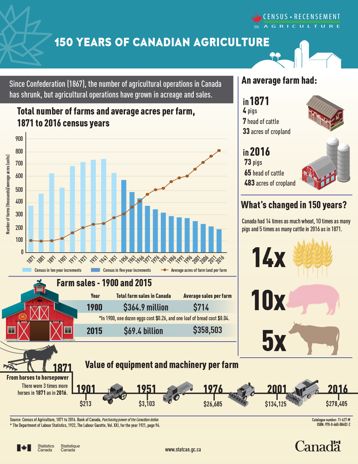
Source: Statistics Canada
Description150 Years of Canadian Agriculture
Since Confederation (1867), the number of agricultural operations in Canada has shrunk, but agricultural operations have grown in acreage and sales.
|
Total number of farms and average acres per farm, 1817 to 2016 census years |
||
|---|---|---|
|
Year |
Total number of farms |
Average acres per farm |
|
Note: 1871 to 1951 Census done every 10 years. 1956 to 2016 Census done every 5 years. |
||
|
1871 |
367,862 |
98 |
|
1881 |
464,025 |
98 |
|
1891 |
620,486 |
97 |
|
1901 |
511,073 |
124 |
|
1911 |
682,329 |
160 |
|
1921 |
711,090 |
198 |
|
1931 |
728,623 |
224 |
|
1941 |
732,832 |
237 |
|
1951 |
623,087 |
279 |
|
1956 |
574,993 |
302 |
|
1961 |
480,877 |
359 |
|
1966 |
430,503 |
404 |
|
1971 |
366,110 |
463 |
|
1976 |
338,552 |
499 |
|
1981 |
318,361 |
511 |
|
1986 |
293,089 |
572 |
|
1991 |
280,043 |
598 |
|
1996 |
276,548 |
608 |
|
2001 |
246,923 |
676 |
|
2006 |
229,373 |
728 |
|
2011 |
205,730 |
778 |
|
2016 |
193,492 |
820 |
An average farm had:
- In 1871: 4 pigs, 7 head of cattle, and 33 acres of cropland.
- In 2016: 73 pigs, 65 head of cattle, and 483 acres of cropland.
What’s changed in 150 years?
Canada had 14 times as much wheat, 10 times as many pigs and 5 times as many cattle in 2016 as in 1871.
|
Farm sales 1900 and 2015 |
||
|---|---|---|
|
Year |
Total farm sales in Canada |
Average sales per farm |
|
Note:In 1900, one dozen eggs cost $0.26, and one loaf of bread cost $0.04.(footnote 1) |
||
|
1900 |
$364.9 million |
$714 |
|
2015 |
$69.4 billion |
$358,503 |
From horses to horsepower- There were 3 times more horses in 1871 as in 2016.
|
Value of equipment and machinery per farm |
|
|---|---|
|
Year |
Average value of equipment and machinery per farm |
|
1901 |
$213 |
|
1951 |
$3,103 |
|
1976 |
$26,685 |
|
2001 |
$134,125 |
|
2016 |
$278,405 |
Source: Census of Agriculture, 1871 to 2016. Bank of Canada - Purchasing power of the Canadian dollar.
Footnote 1: The Department of Labour Statistics, 1922. The Labour Gazette, Vol. XXI, for the year 1921, page 96.
Action
Deconstructing an infographic
Check out the following two infographics. Choose one of the infographics to analyze. Complete Analyzing an Infographic in your notebook or use the following fillable and printable document. If you prefer, use another method to record your ideas.
| Design elements |
|
Jot down your ideas about the design elements that have been used (fonts, graphics, text choices, etc.). |
| General message, topic, and theme |
|
What audience do you think the infographic was intended for? What messages do you think the author was trying to share? |
|
What facts were included to support the message, topic, and theme? |
|
What graphs, charts, and images were used? What data visualizations has the author used? Why do you think they were chosen? |
|
How could you change the infographic to make it more effective? |
Press the ‘Activity’ button to access Analyzing an Infographic.
Option 1
Press ‘Canadians' Consumption of Vegetables and Fruits’ to reveal the infographic.
Canadians' Consumption of Vegetables and Fruits
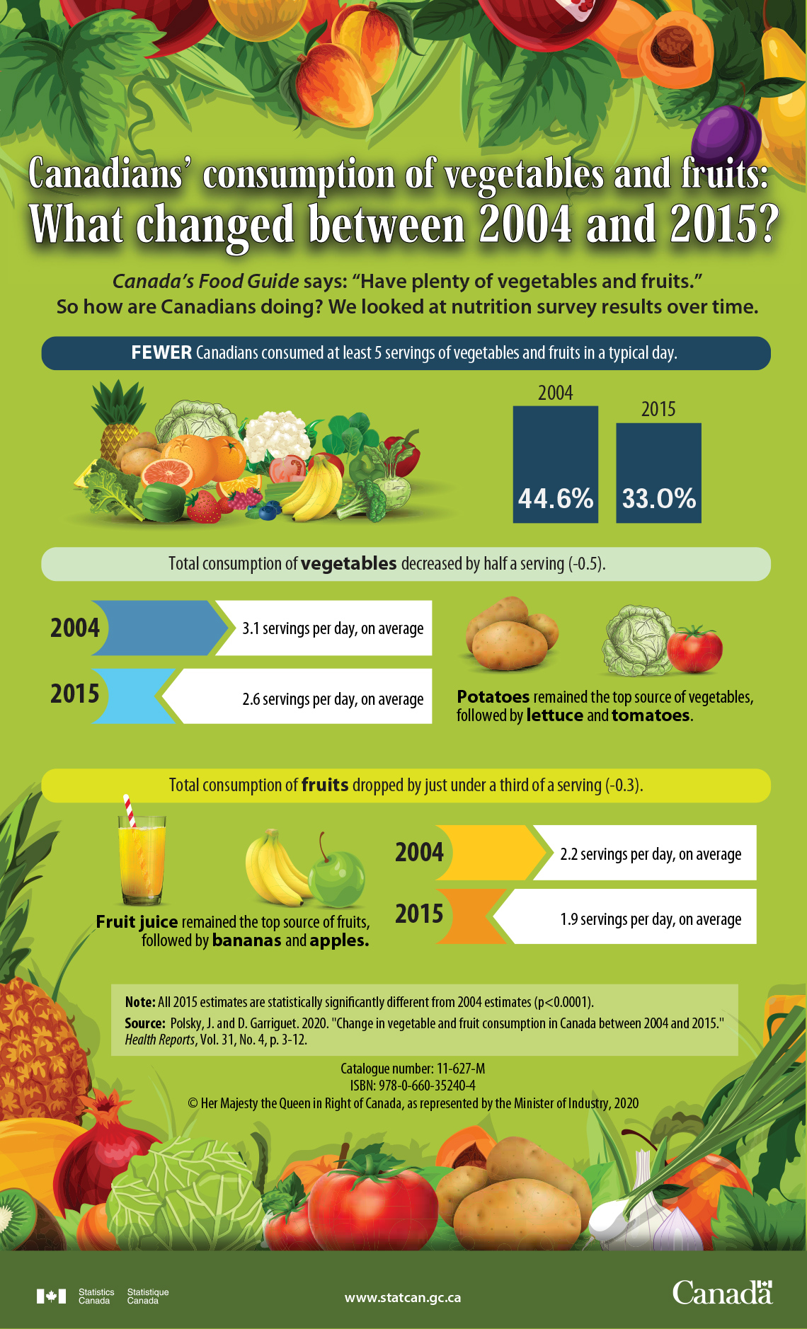
Source: Statistics Canada
Description
Description: Canadians’ consumption of vegetables and fruits: What changed between 2004 and 2015?
Canada’s Food Guide says: “Have plenty of vegetables and fruits.” So how are Canadians doing? We looked at nutrition survey results over time.
Fewer Canadians consumed at least 5 servings of vegetables & fruits in a typical day.
2004: 44.6%
2015: 33.0%
Total consumption of vegetables decreased by half a serving (-0.3).
2004: 3.1 servings per day, on average
2015: 2.6 servings per day, on average
Potatoes remained the top source of vegetables, followed by lettuce and tomatoes.
Total consumption of fruits dropped by just under a third of a serving (-0.3).
2004: 2.2 servings per day, on average
2015: 1.9 servings per day, on average
Fruit juice remained the top source of fruits, followed by bananas and apples.
Note: All 2015 estimates are statistically significantly different from 2004 estimates (p < 0.0001).
Source: Polsky, J. and D. Garriguet. 2020. "Change in vegetable and fruit consumption in Canada between 2004 and 2015.," Health Reports, Vol. 31, No. 4, p. 3-12.
Option 2
Press ‘Zero-Emission Vehicles in Canada, 2020’ to reveal the infographic.
Zero-Emission Vehicles in Canada, 2020
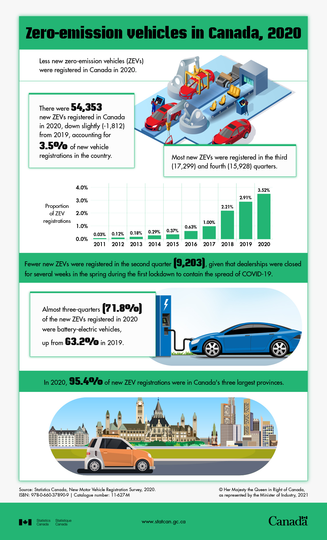
Source: Statistics Canada
DescriptionZero-emissions vehicles in Canada, 2020
Less new zero-emission vehicles (ZEVs) were registered in Canada in 2020.
There were 54,353 new ZEVs registered in Canada in 2020, down slightly (-1,812) from 2019, accounting for 3.5% of new vehicle registrations in the country.
Most new ZEVs were registered in the third (17,299) and fourth (15,928) quarters.
|
Proportion of ZEV registrations Table summary This table displays the results of Table 1. The information is grouped by Reference period (appearing as row headers), ZEVs proportion (appearing as column headers). |
|
|---|---|
|
Reference period |
ZEVs proportion |
|
2011 |
0.03% |
|
2012 |
0.12% |
|
2013 |
0.18% |
|
2014 |
0.29% |
|
2015 |
0.37% |
|
2016 |
0.63% |
|
2017 |
1.00% |
|
2018 |
2.21% |
|
2019 |
2.91% |
|
2020 |
3.52% |
Fewer new ZEVs were registered in the second quarter (9,203), given that dealerships were closed for several weeks in the spring during the first lockdown to contain the spread of COVID-19.
Almost three-quarters (71.8%) of the new ZEVs registered in 2020 were battery-electric vehicles, up from 63.2% in 2019.
In 2020, 95.4% of new ZEV registrations were in Canada’s three largest provinces.
Source: Statistics Canada, New Motor Vehicle Registration Survey, 2020.
Consolidation
Use your analysis
Brainstorm
Redesign the infographic

For this exercise, you’ll use your analysis of the infographic from the last activity. Use the method of your choice to record your thoughts and ideas.
- Choose a different audience. Consider how this would affect your infographic.
- What would you add? What would you remove? What would you change?
Option 1
Press ‘Canadians' Consumption of Vegetables and Fruits’ to reveal the infographic.
Canadians' Consumption of Vegetables and Fruits
Source: Statistics Canada
Description
Description: Canadians’ consumption of vegetables and fruits: What changed between 2004 and 2015?
Canada’s Food Guide says: “Have plenty of vegetables and fruits.” So how are Canadians doing? We looked at nutrition survey results over time.
Fewer Canadians consumed at least 5 servings of vegetables & fruits in a typical day.
2004: 44.6%
2015: 33.0%
Total consumption of vegetables decreased by half a serving (-0.3).
2004: 3.1 servings per day, on average
2015: 2.6 servings per day, on average
Potatoes remained the top source of vegetables, followed by lettuce and tomatoes.
Total consumption of fruits dropped by just under a third of a serving (-0.3).
2004: 2.2 servings per day, on average
2015: 1.9 servings per day, on average
Fruit juice remained the top source of fruits, followed by bananas and apples.
Note: All 2015 estimates are statistically significantly different from 2004 estimates (p < 0.0001).
Source: Polsky, J. and D. Garriguet. 2020. "Change in vegetable and fruit consumption in Canada between 2004 and 2015.," Health Reports, Vol. 31, No. 4, p. 3-12.
Option 2
Press ‘Zero-Emission Vehicles in Canada, 2020’ to reveal the infographic.
Zero-Emission Vehicles in Canada, 2020
Source: Statistics Canada
DescriptionZero-emissions vehicles in Canada, 2020
Less new zero-emission vehicles (ZEVs) were registered in Canada in 2020.
There were 54,353 new ZEVs registered in Canada in 2020, down slightly (-1,812) from 2019, accounting for 3.5% of new vehicle registrations in the country.
Most new ZEVs were registered in the third (17,299) and fourth (15,928) quarters.
|
Proportion of ZEV registrations Table summary This table displays the results of Table 1. The information is grouped by Reference period (appearing as row headers), ZEVs proportion (appearing as column headers). |
|
|---|---|
|
Reference period |
ZEVs proportion |
|
2011 |
0.03% |
|
2012 |
0.12% |
|
2013 |
0.18% |
|
2014 |
0.29% |
|
2015 |
0.37% |
|
2016 |
0.63% |
|
2017 |
1.00% |
|
2018 |
2.21% |
|
2019 |
2.91% |
|
2020 |
3.52% |
Fewer new ZEVs were registered in the second quarter (9,203), given that dealerships were closed for several weeks in the spring during the first lockdown to contain the spread of COVID-19.
Almost three-quarters (71.8%) of the new ZEVs registered in 2020 were battery-electric vehicles, up from 63.2% in 2019.
In 2020, 95.4% of new ZEV registrations were in Canada’s three largest provinces.
Source: Statistics Canada, New Motor Vehicle Registration Survey, 2020.
Checklist
Use the following checklist to make sure your infographic has all the required elements. Complete Checklist: Infographic in your notebook or use the following fillable and printable document. If you prefer, use another method to record the information.
Checklist: Infographic
|
Includes a title and headings. |
|
|
Creates a story about data. |
|
|
Includes graphics (including one data table and one circle graph). |
|
|
Describes and summarizes the data. |
Press the ‘Activity’ button to access Checklist: Infographic.
Reflection
As you read the following descriptions, select the one that best describes your current understanding of the learning in this activity. Press the corresponding button once you have made your choice.
I feel…
Now, expand on your ideas by recording your thoughts using a voice recorder, speech-to-text, or writing tool.
When you review your notes on this learning activity later, reflect on whether you would select a different description based on your further review of the material in this learning activity.
Connect with a TVO Mathify tutor
Think of TVO Mathify as your own personalized math coach, here to support your learning at home. Press ‘TVO Mathify’ to connect with an Ontario Certified Teacher math tutor of your choice. You will need a TVO Mathify login to access this resource.
TVO Mathify (Opens in new window)